

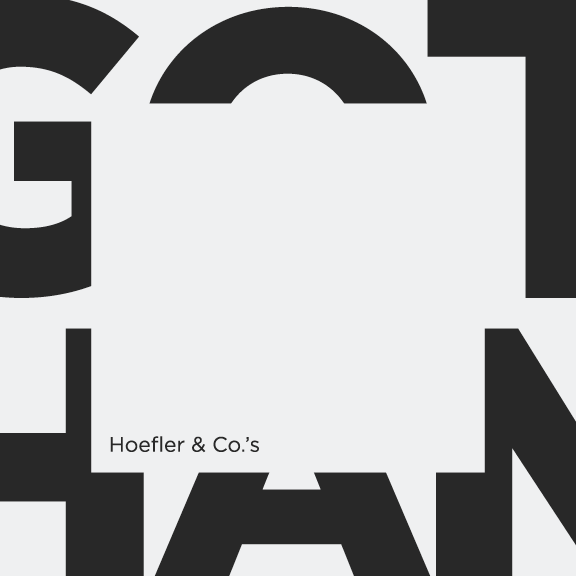
Gotham
Type Specimen Booklet
Gotham
Type Specimen
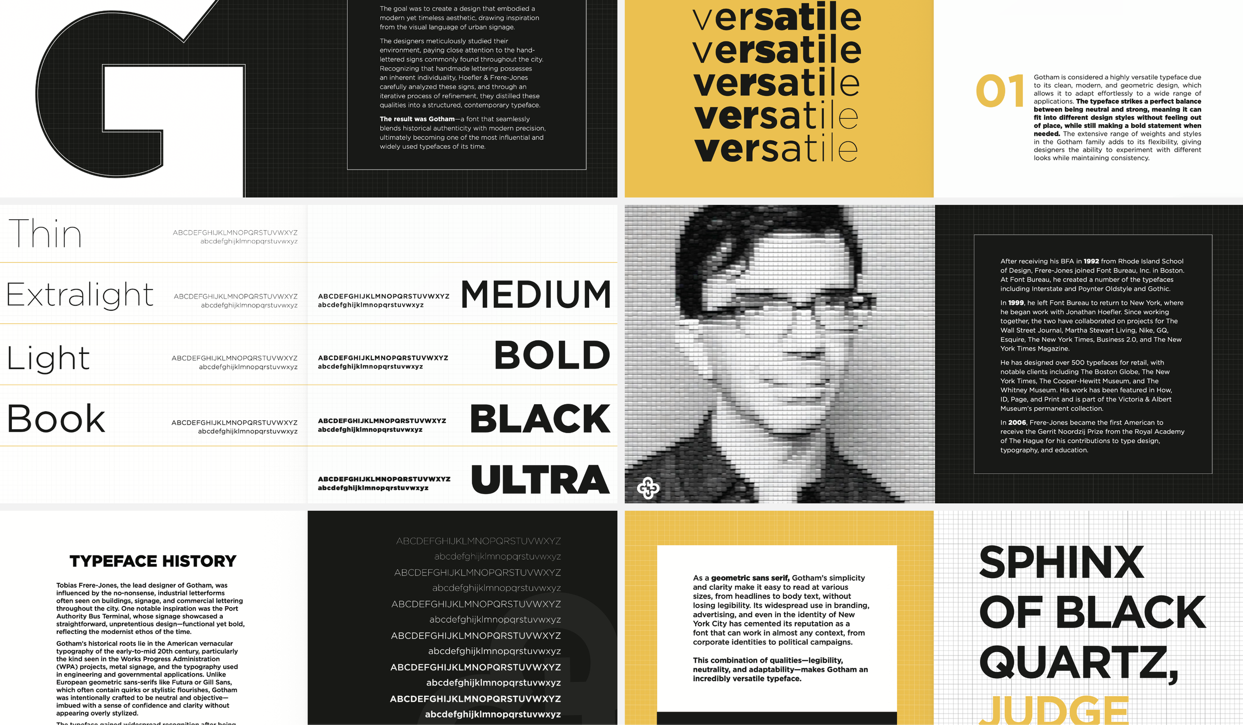
This project explores the history, structure, and application of the Gotham typeface, designed by Hoefler & Frere-Jones. It combines typographic analysis with visual composition, presenting font family details alongside contextual and historical information.
Project Type: Typeface Specimen Booklet
Role: Lead Product Designer
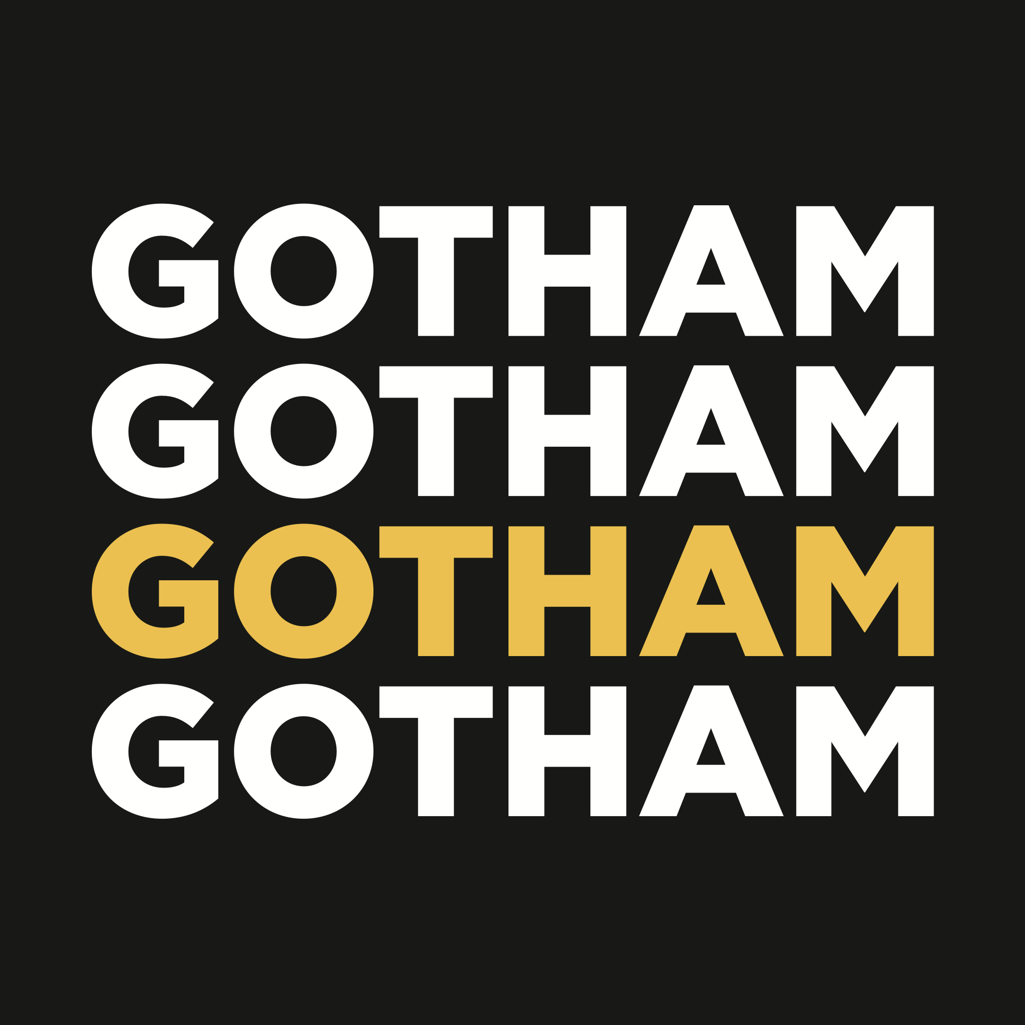
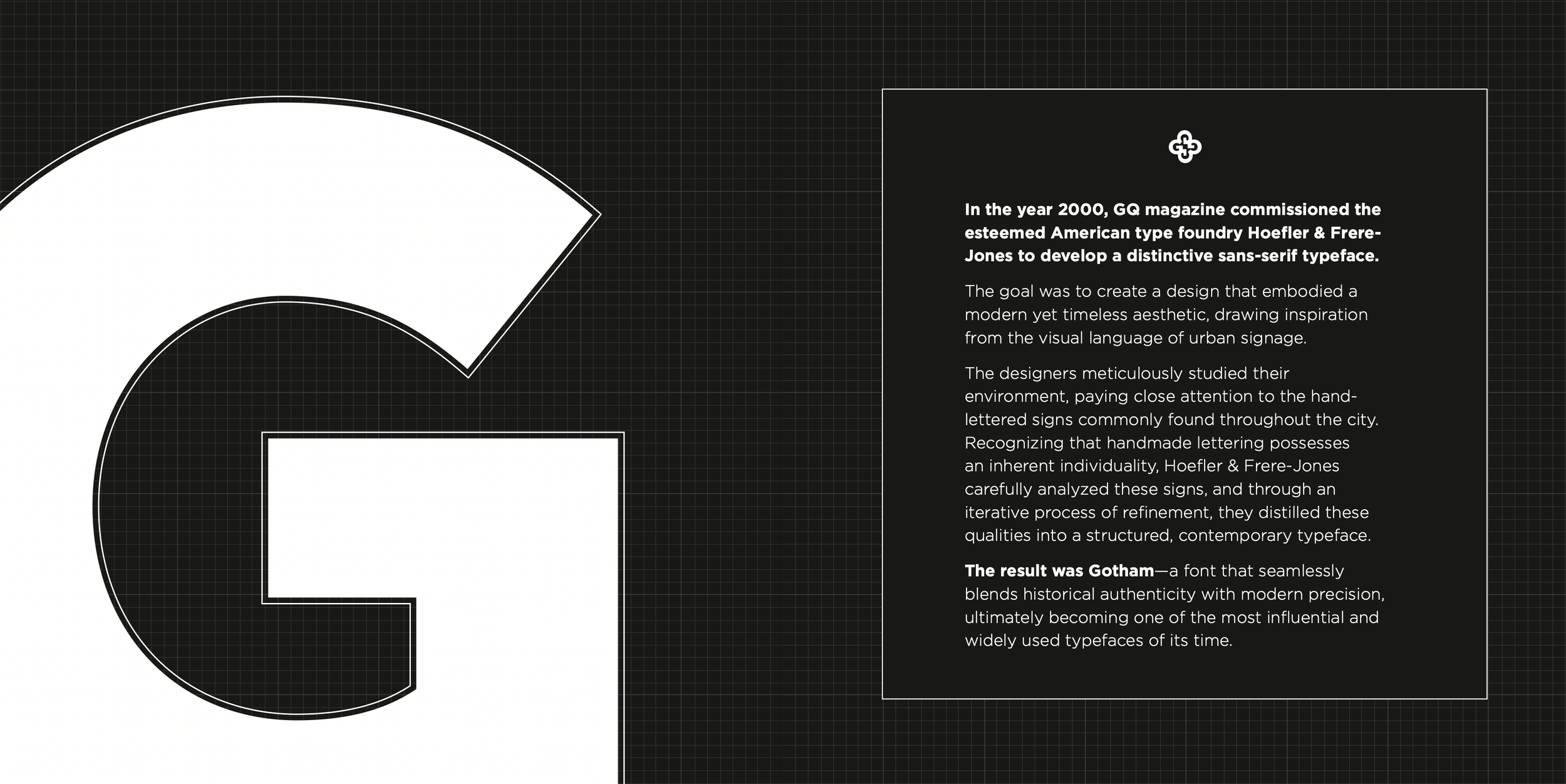
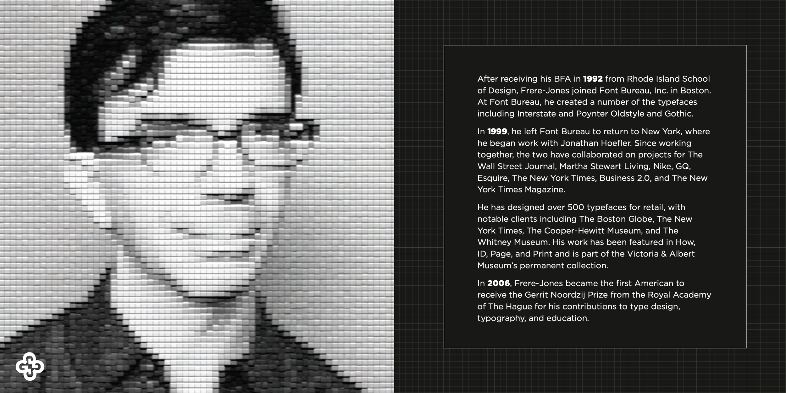
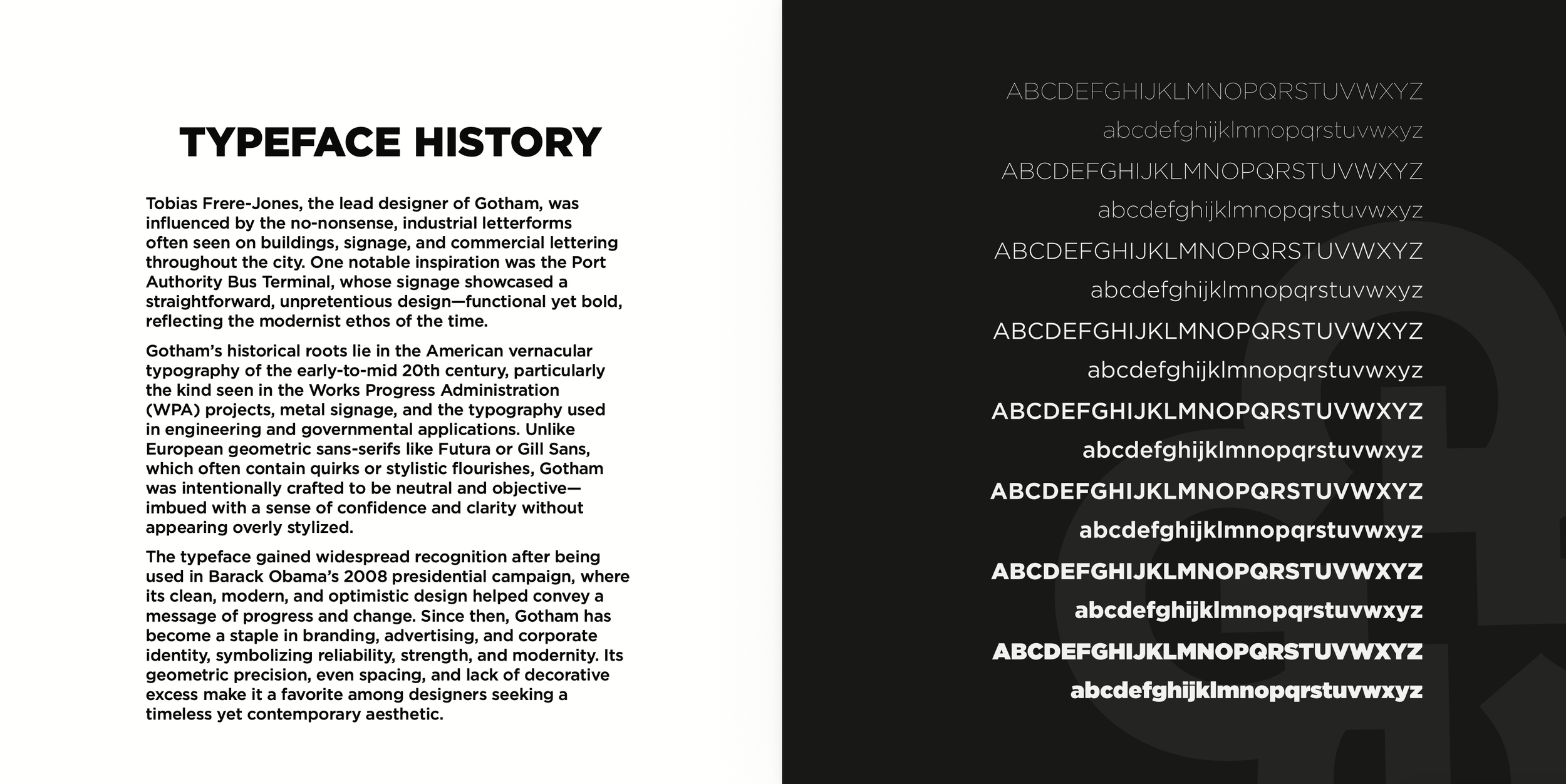
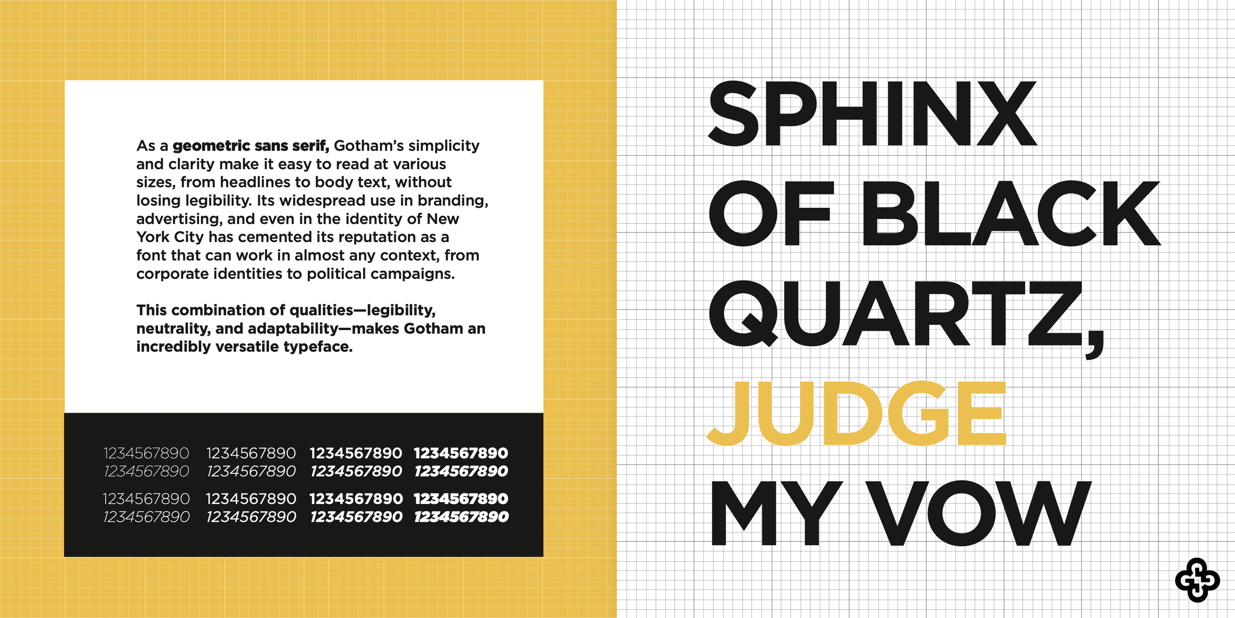
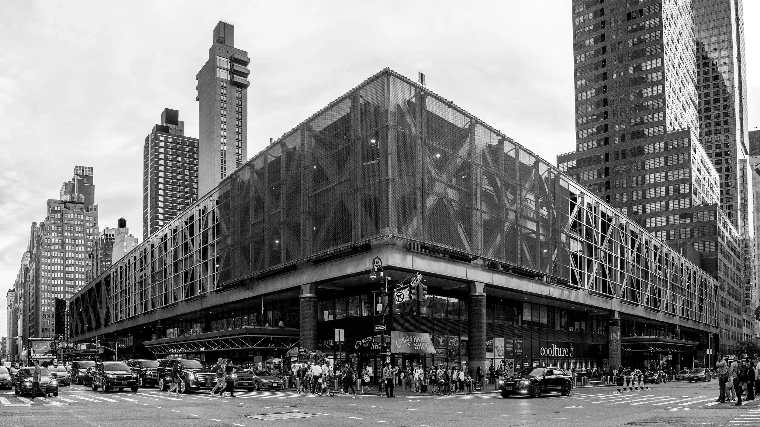
HISTORYDesigned by Tobias Frere-Jones in 2000 and released by Hoefler & Co., Gotham is a widely popular geometric sans-serif typeface inspired by the "honest," utilitarian lettering on New York City buildings, particularly the Port Authority Bus Terminal.
Originally commissioned by GQ magazine for a masculine, "fresh" headline font, its reputation skyrocketed after being used in Barack Obama’s 2008 presidential campaign.
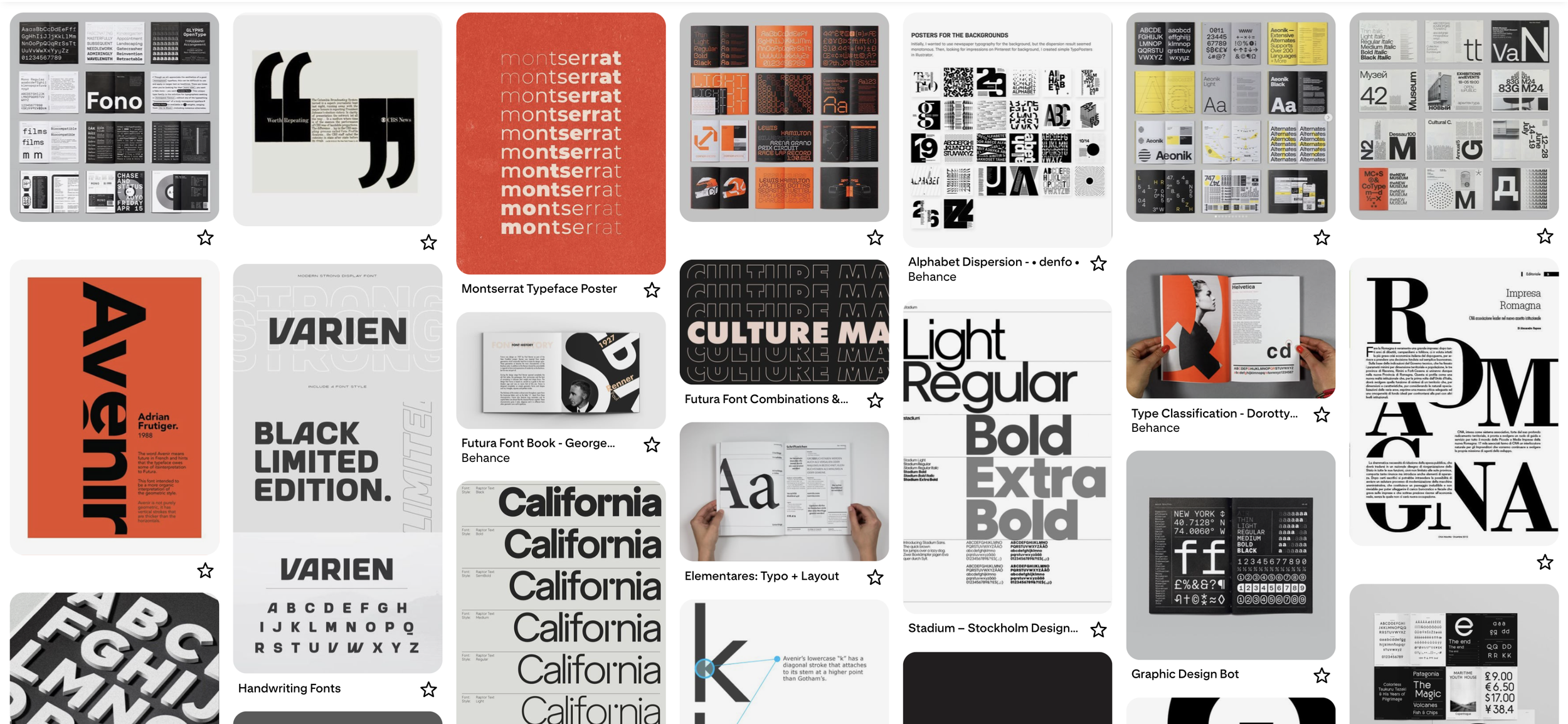
GATHERING INSPIRATION
When approaching a new design project is to spend about 2-3 hours on Pinterest, before even touching InDesign or Illustrator. I don’t begin any sort of technical design until I’ve worked out what I want to make, and how I plan to do so. I try to avoid pure re-creation, as that creates an echo chamber in the design world, but rather, adopt certain techniques or visual styles that will enhance my own creativity (at least, I try my best).
SKETCHES
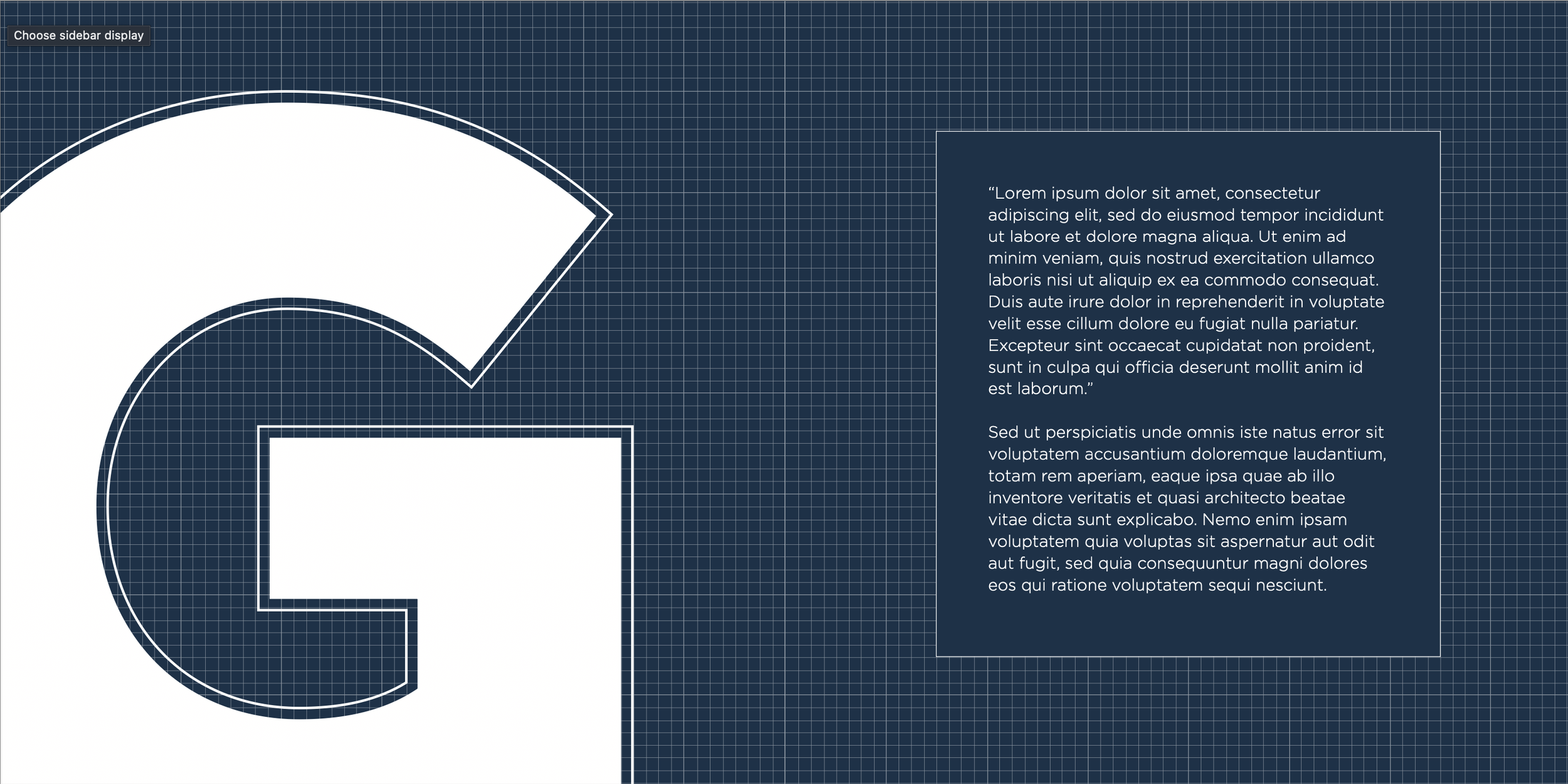
This was an idea for a back cover design, inspired by using the capital “G” in Gotham Black, turned into a clover-like symbol. In Adobe Illustrator, I used a text box, turned it into outlines, and arranged them accordingly.
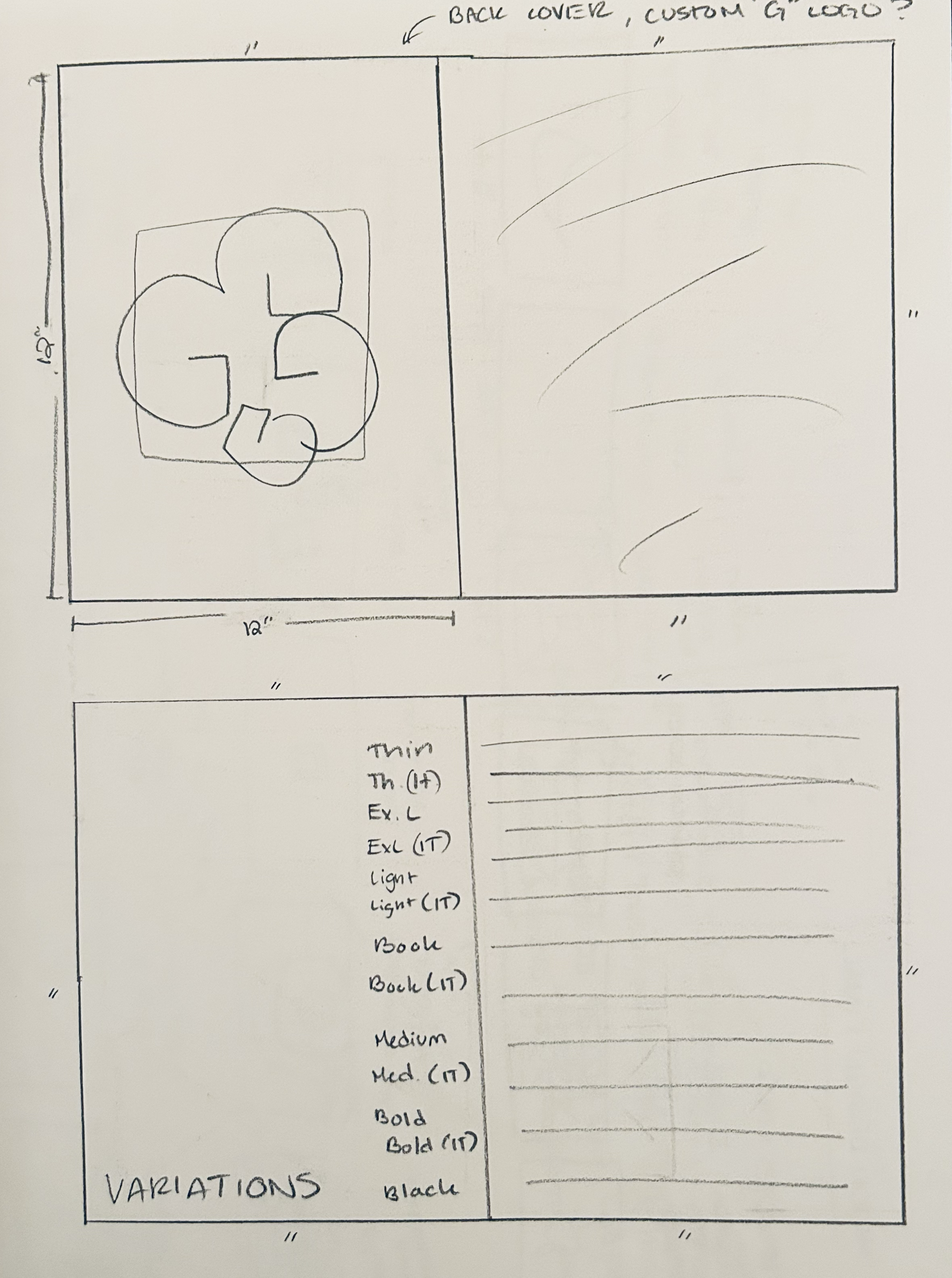
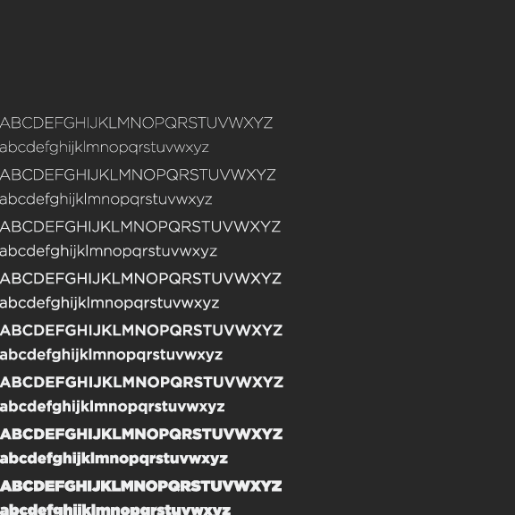
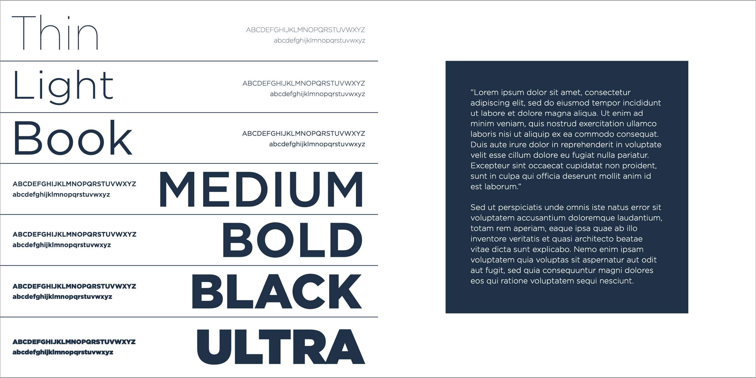
A bare-bones idea for how I was going to organize the numerous weight variations that Gotham offers. I ended up exploring this and refining it several times for the final.
Initial, incredibly basic cover design sketch was the basis for the covers of my three compositions, which each became more refined and individualized. I liked the clean, professional look of Gotham Bold, so that was the version I defaulted to for each of the three covers.
Experimenting with
Color Palettes
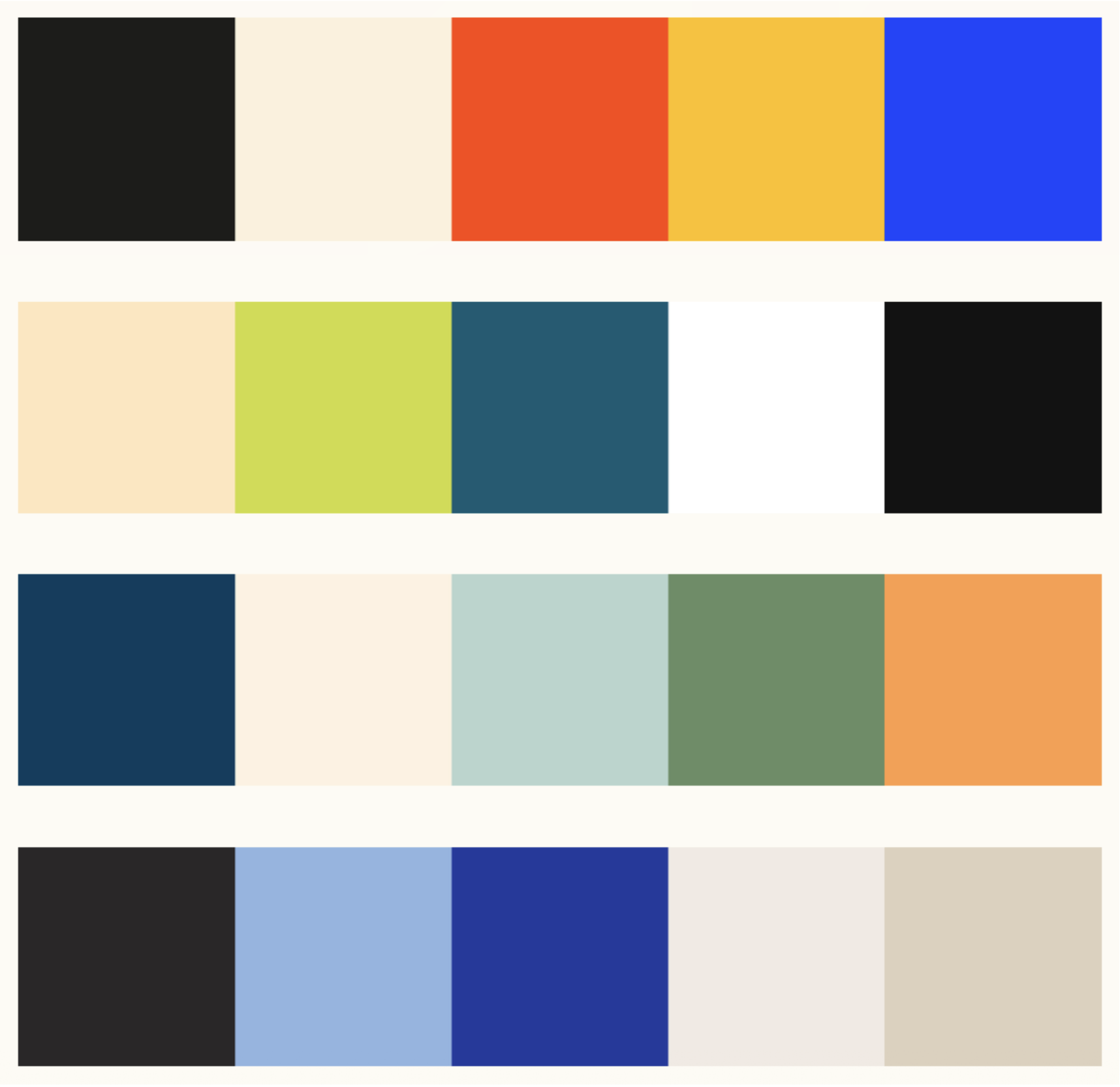
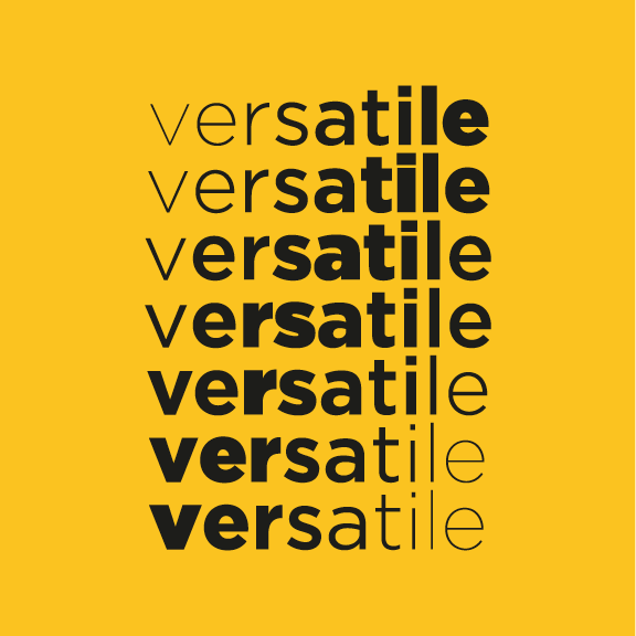
I explored colorful artwork, photography, and designs on Pinterest and used Coolors.co to create color palettes from the images that I loved the most. I came up with four color palettes, each with its own unique feel. However, I wanted my designs to focus primarily on the typeface, as opposed to an over-colorful visual experience.
INITIAL COMPOSITIONs
FIRST COMPOSITION
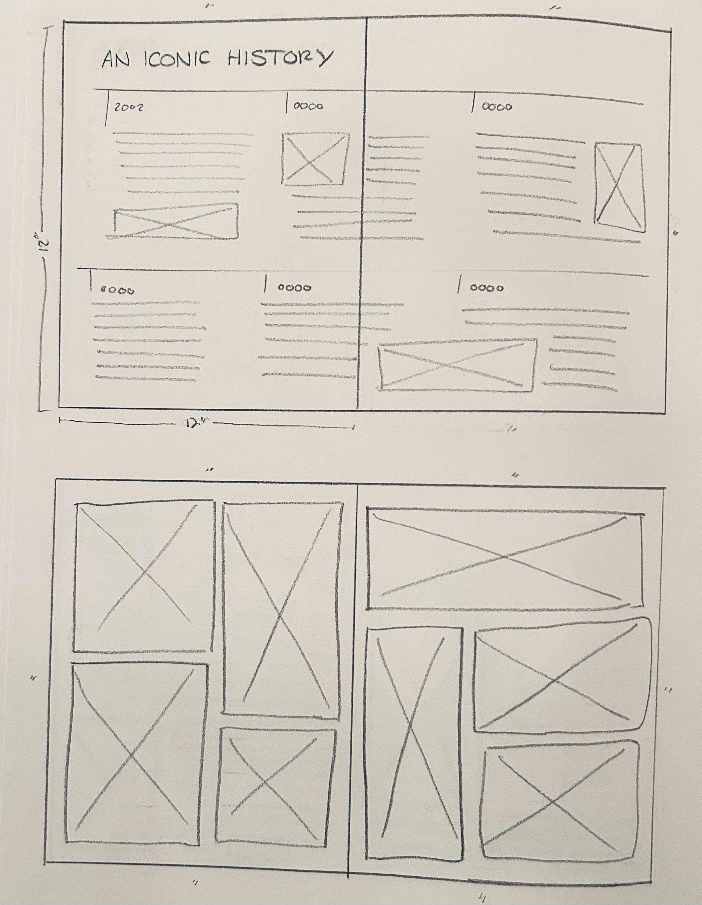
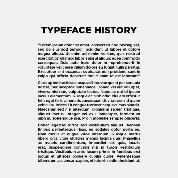
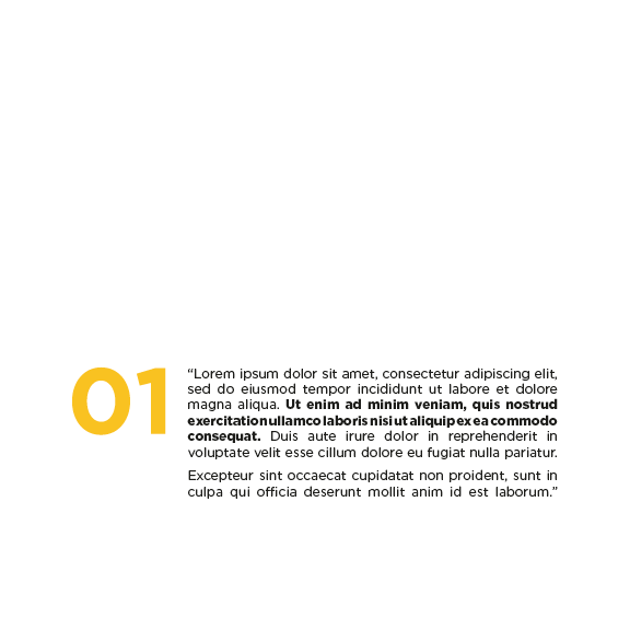
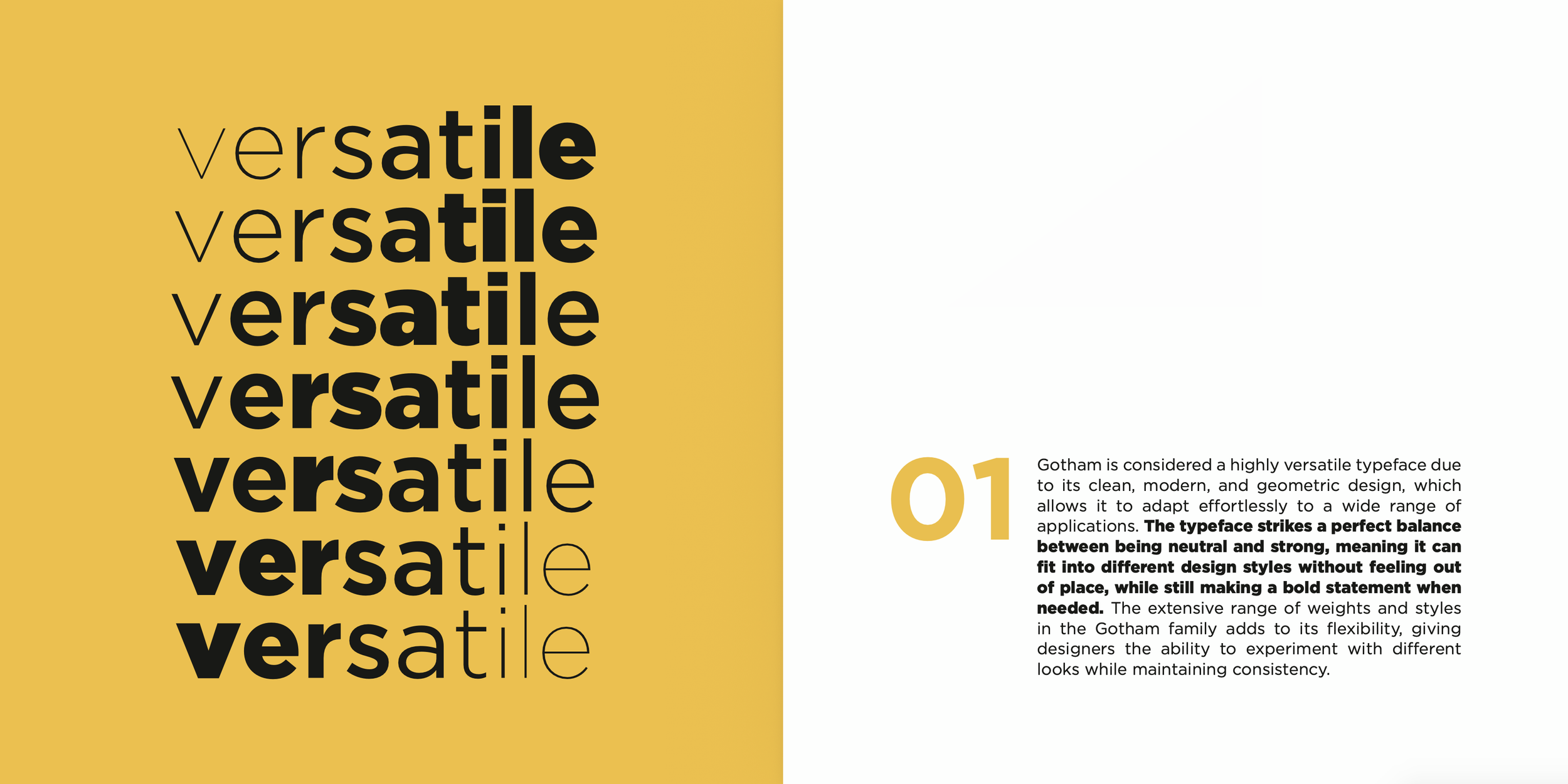
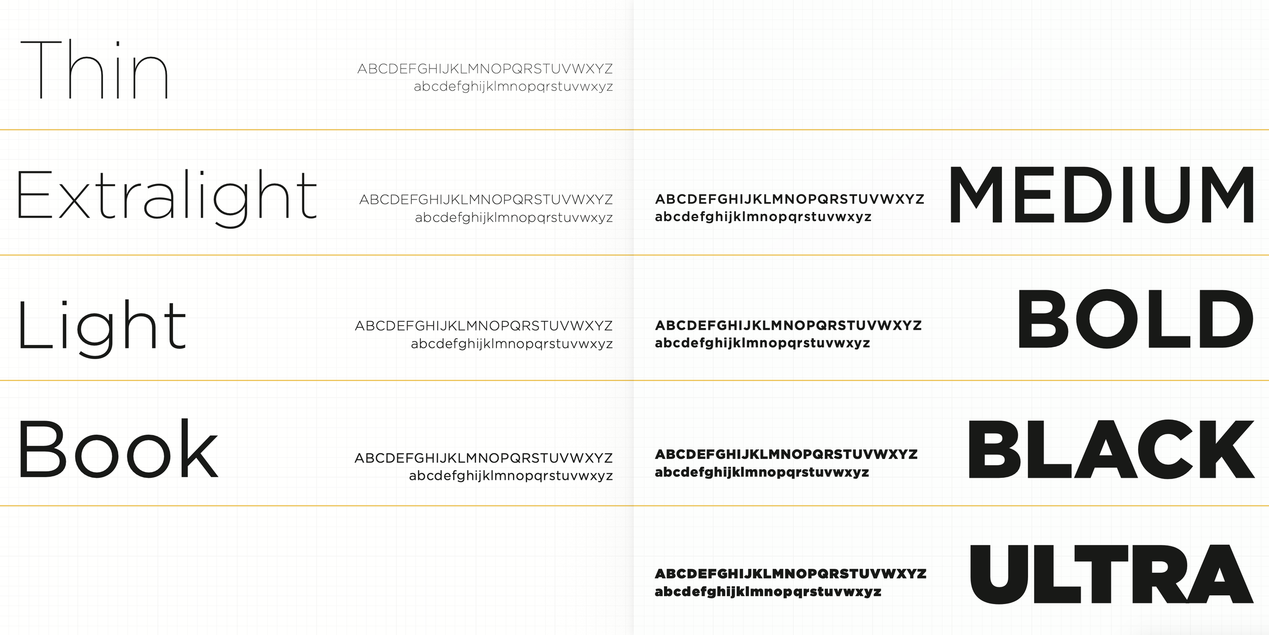
This was my very first barebones attempt at a general idea of what a spread for the typeface booklet project could look like, covering both long-form text information as well as showing the versatility of the Gotham typeface through displaying the various typeface weights, ranging from Thin to Black.


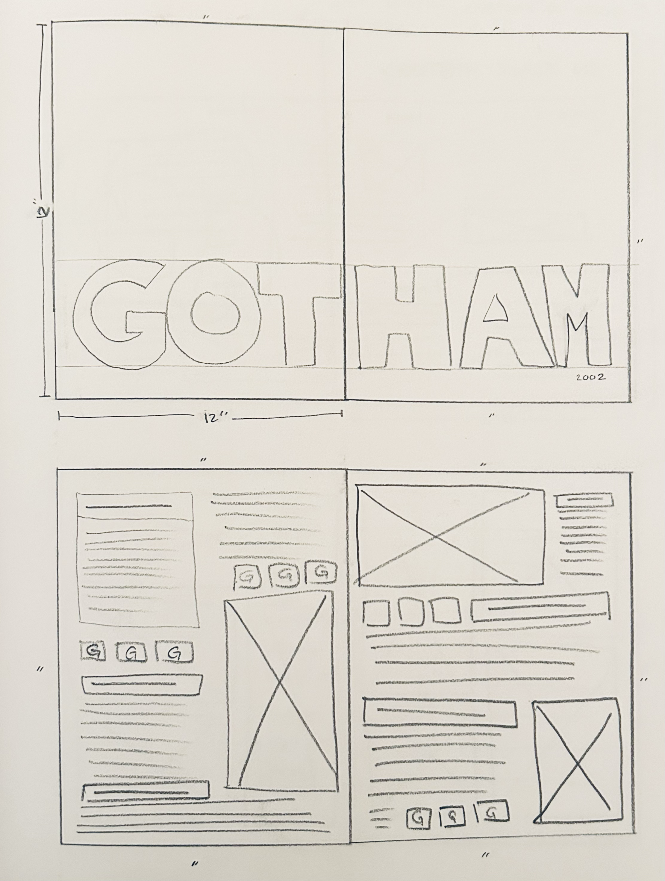
SECOND COMPOSITION
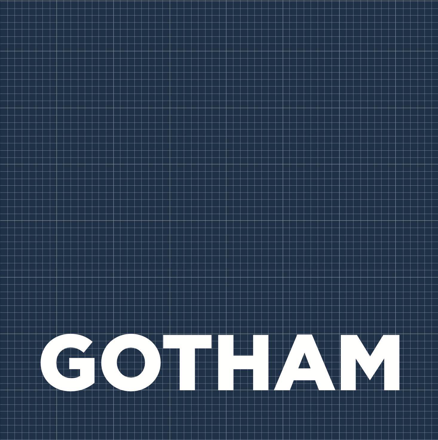
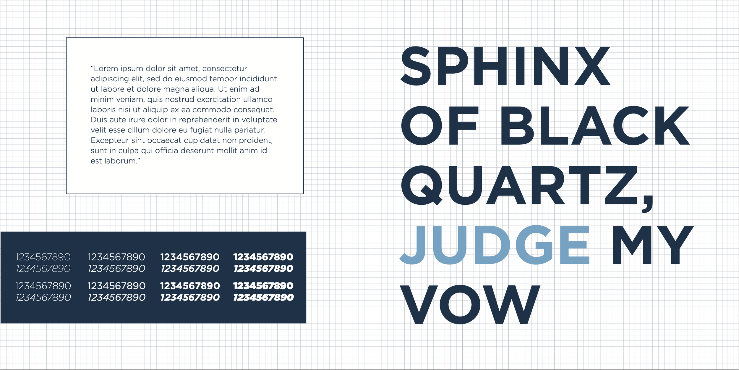
This composition was the most developed of the initial three, and became the “blueprint” (pun fully intended) of the final composition’s foundation. The spread that underwent the most significant change was the one on the bottom right of this page, whose left page became a full spread, showcasing all eight of the typeface’s weights.


THIRD COMPOSITION
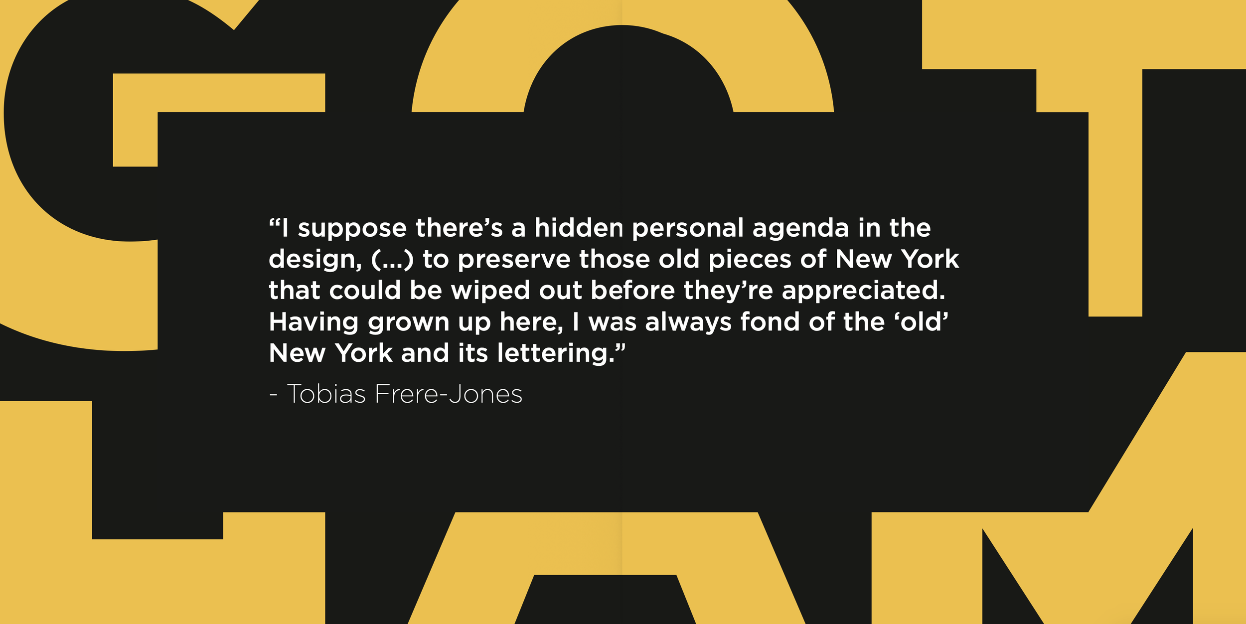
This second composition ended up being the strongest in terms of color contrast, and I have used a similar color palette in the past that has been quite successful. I am a huge fan of black and yellow! This particular spread received several compliments during initial critiques, and was praised for being very clean and visually pleasing, from the “gradient” of letter weights, the alignment and margins/spacing of the text box, and the overall use of negative space.
FINAL
PRODUCT
After receiving a few critique notes from my original comps, I took elements from each of the three designs and “married” them into one cohesive final composition. I thoroughly enjoy the way that many of these come out, and I think that they are effective in communicating the value of this typeface.

This project taught me the importance of making multiple compositions and working through design blocks. There are ways to blend different elements together to make a successful product, rather than just sticking to the first version that you create.
It also taught me to work within a strict color palette (just three colors total), and to understand the goals of your project. Because I wanted the focus of this project to be the typeface itself, I didn’t want to overwhelm the viewer with excessive amounts of color or needlessly complicated palettes.
What I Learned:
Design takes time and is a thoroughly iterative process
Never go with your first idea: always push yourself beyond what you think is your limit (you are capable of more than you think)
Design within the context of your project!
REFLECTION