


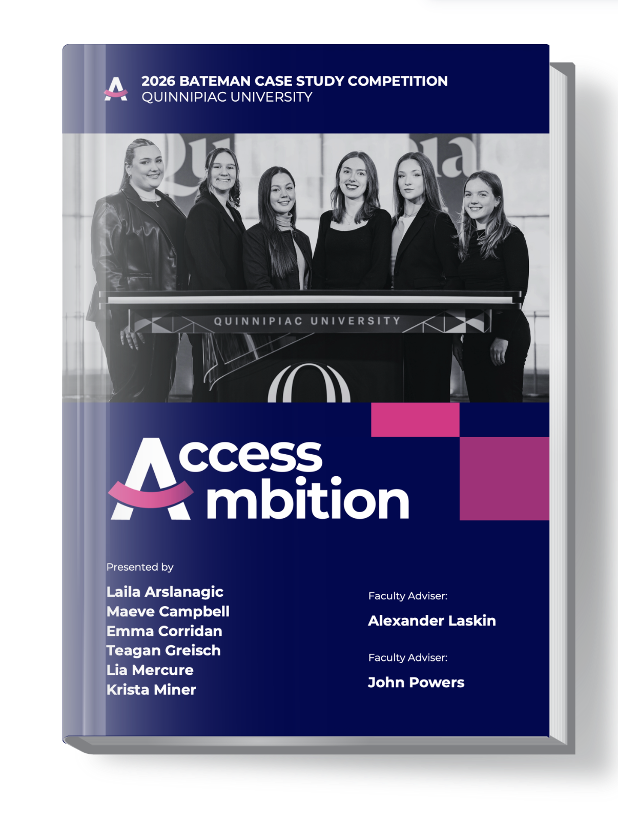
2026 Bateman Competition
Report - Quinnipiac
2026 Bateman Competition
Report - Quinnipiac
Launched in 1973 under the name National Case Study and later dedicated to J. Carroll Bateman, APR, the Bateman Case Study Competition immerses college teams in the full lifecycle of a public relations campaign for an actual client.
Students are responsible for conducting in-depth research, developing strategy, executing their plans, and measuring results. The program offers practical experience that strengthens portfolios, sharpens professional skills, and opens doors to future careers.
Scope: PDF Report
Role: Director of Creative Strategy
OVERVIEW
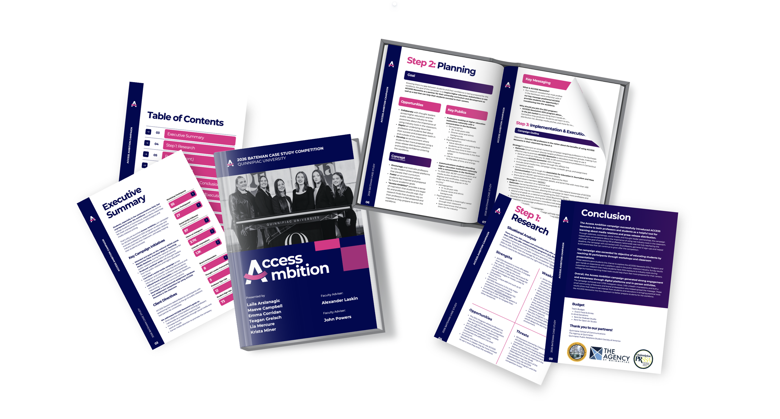
The design aimed to translate a dense, research-heavy campaign into a structured, visually digestible report that demonstrates the strategic thinking behind the work.
The report was designed to balance professionalism with clarity, ensuring that both evaluators could easily navigate and understand the campaign’s depth, outcomes, and impact.
GOALS

Produce a comprehensive strategy report for the Quinnipiac Bateman Team
Utilize client (ACCESS Newswire) branding to reflect unity
Demonstrate team cohesion and in-depth understanding of the client’s goals and needs
Display information in a navigable, digestible way
Ultimately, win the national competition!
Access Ambition Campaign Website Design
In addition to designing the final report, I also had the opportunity to design a comprehensive website for the Access Ambition campaign.
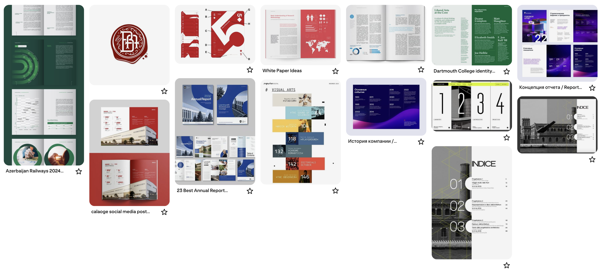
GATHERING INSPIRATION
Prior to opening my design software, I took time to research report design and standard page layouts on Pinterest. Due to the strict guidelines of the competition, I was unable to be creative with the document layouts and visuals, so I had to design with more compact information.
I created a board and saved a selection of relevant designs for inspiration, and a jumping-off point.
→ This wasn’t the kind of project that I needed to re-invent the wheel for!
CURATING + DEFINING IDENTITY
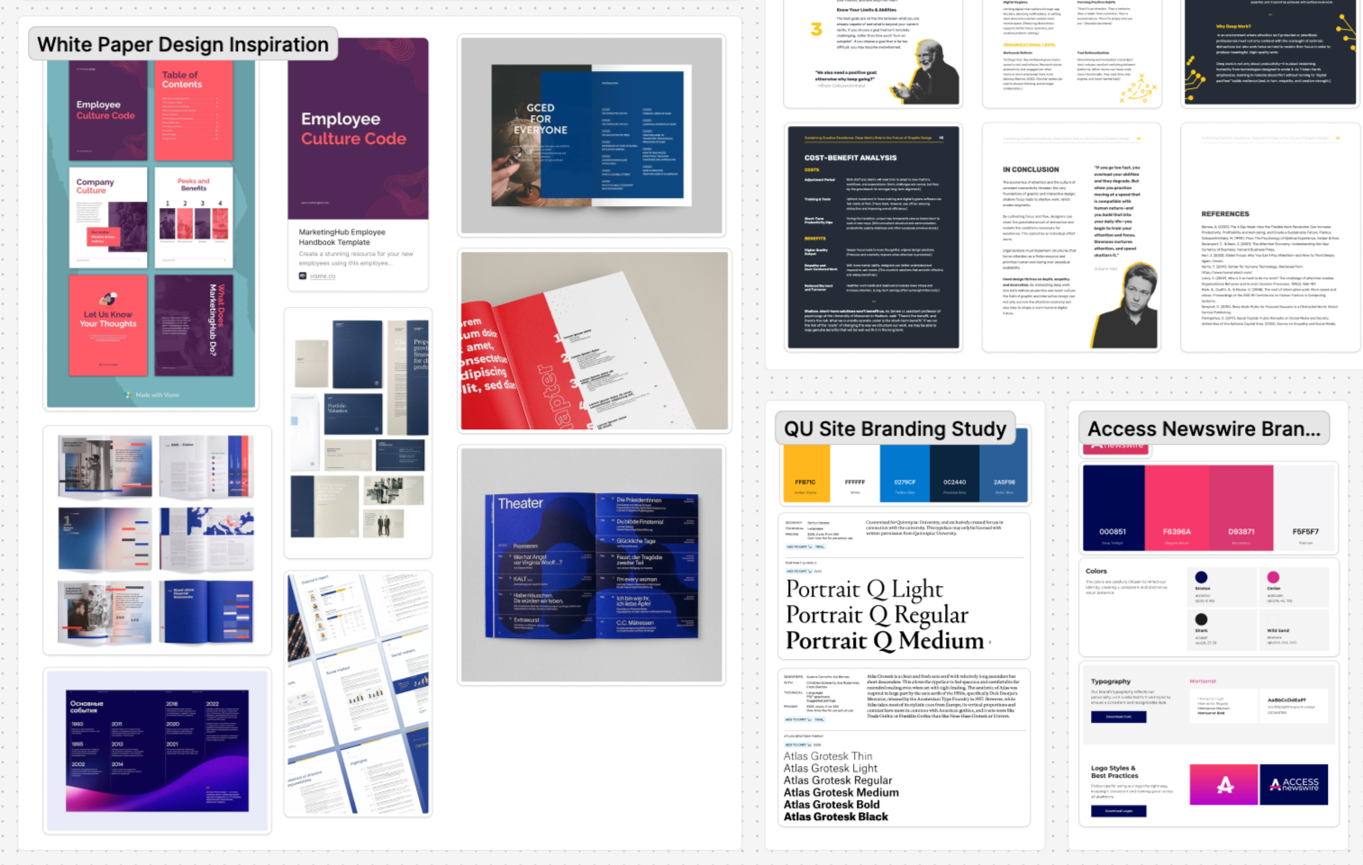
I also created a FigJam board , where I collected and organized more design inspiration and identified key branding information.
I had written a white paper previously (link to white paper blog post here), and decided that the layout and structure of that document more closely reflected what was expected for the final submission.
I met with my team members and discussed ideas, and we collectively opted to incorporate the client’s branding into our work, as opposed to the Quinnipiac brand identity.
Key Design Elements


PRINCIPLE
Structured Hierarchy
Repetition for
Brand Cohesion
Emphasis,
Not Overload
Purposeful
Balance
Academic
& Industry Hybrid Tone
Modular Content Design
Cross-Platform
Consistency
NOTES
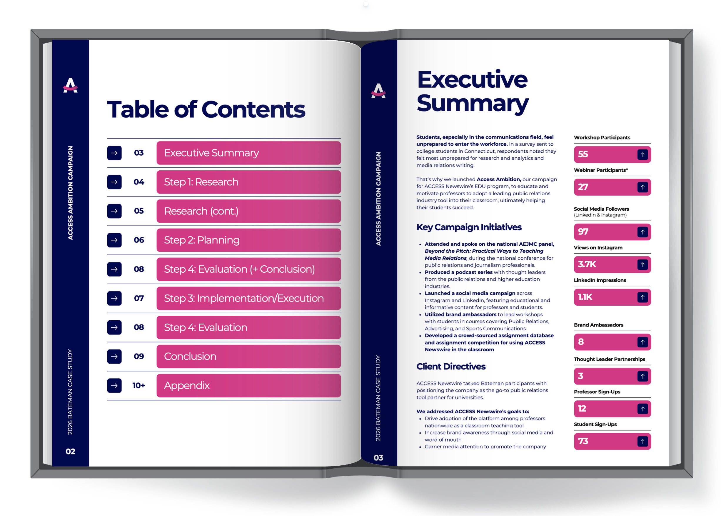
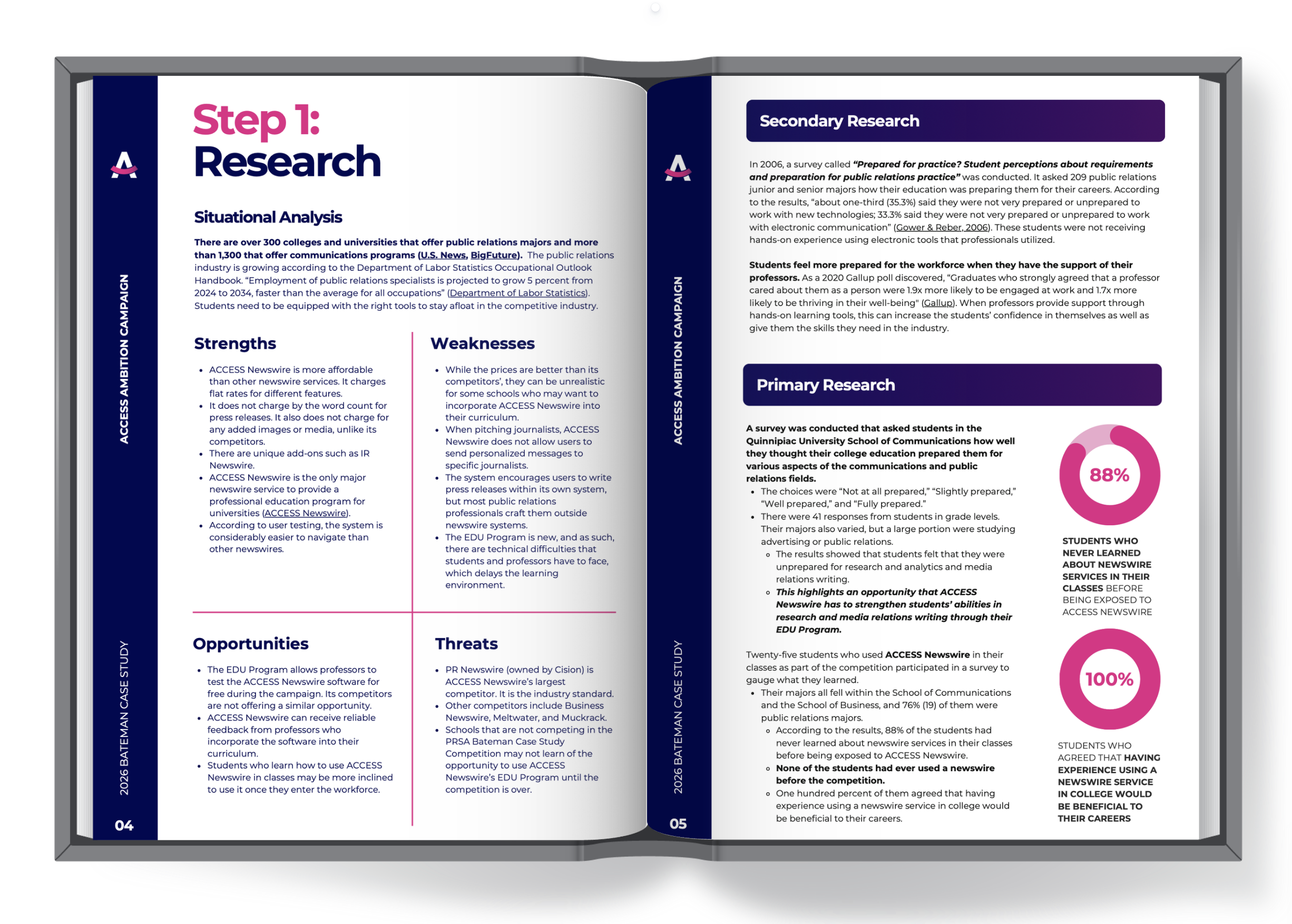
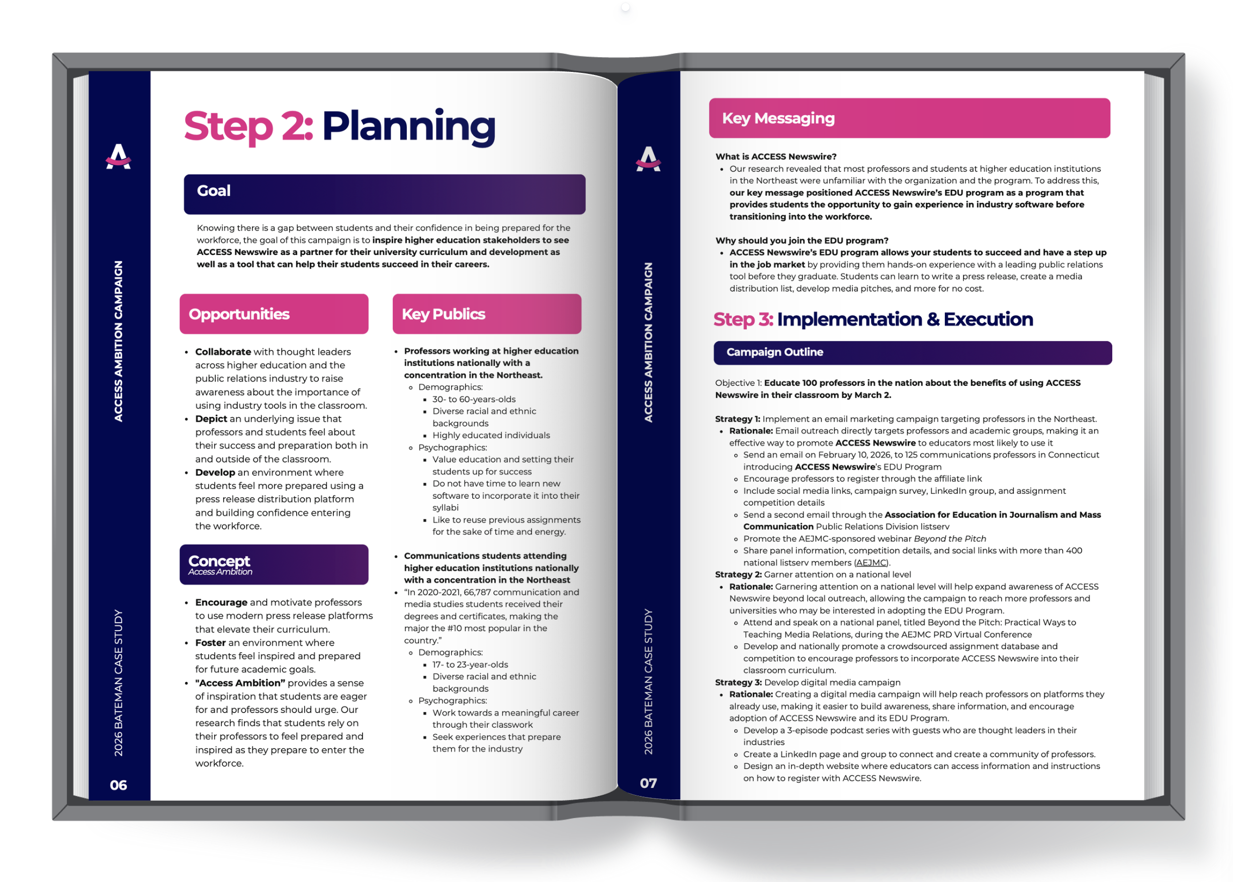
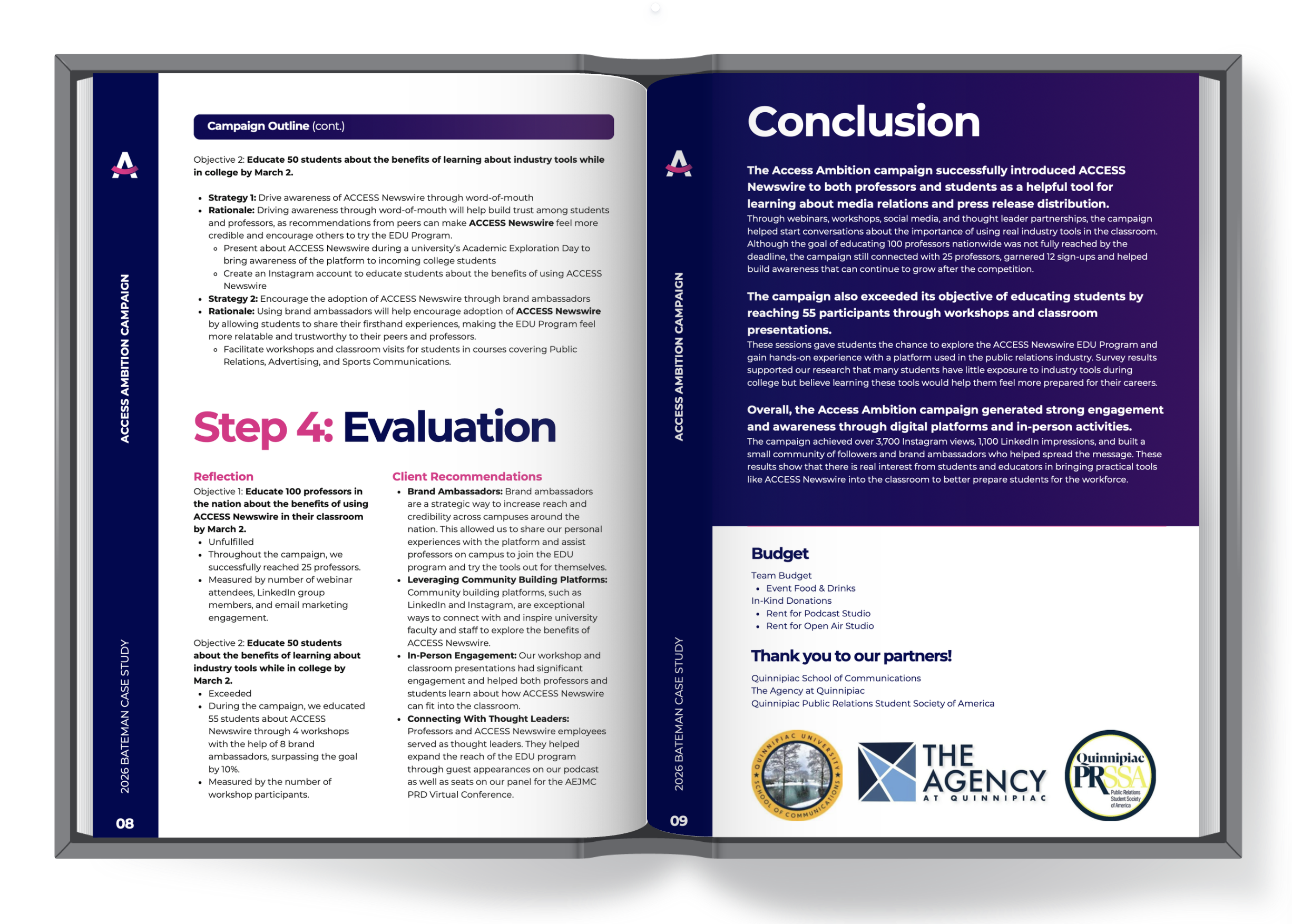
The document followed a clear, step-based progression (Research → Planning → Implementation → Evaluation), reinforcing the strategic framework of the campaign itself. Headings, numbering systems, and consistent section breaks were used to guide the reader and reduce cognitive load.
The repeated use of the “Access Ambition Campaign” title and vertical typographic elements created a sense of continuity throughout the document. While subtle, this repetition reinforced brand recognition and unified the report as a single, cohesive piece rather than a collection of separate sections.
Rather than relying heavily on complex charts, key statistics were isolated and scaled to act as visual anchors. This decision prioritized immediate readability and ensured that the most important insights stood out at a glance, aligning with how stakeholders typically skim reports for key outcomes. These deliverables were also presented in the executive summary at the beginning of the document, allowing evaluators to understand our key metrics without having to search through the entire document.
Given the high volume of written content, intentional spacing was used to prevent visual fatigue. Margins, line breaks, and section spacing created a bit of breathing room, allowing readers to engage with the information without feeling too overwhelmed. (This balance was especially important in research-heavy sections.)
The visual language of the document was designed to sit between an academic report and a professional agency deliverable. Clean layouts, minimal decoration, and consistent typography reinforced credibility, while more dynamic elements (bold statistics, campaign branding) introduced a sense of modernity and engagement.
Sections such as SWOT analyses, key messaging, and strategies were broken into digestible blocks rather than long paragraphs. This modular approach allowed readers to scan for specific information quickly, which is critical in both the judging and professional review contexts.
Because the campaign extended beyond the report (social media, podcast, website), the document maintained visual consistency with those materials. This ensured that the report did not feel disconnected from the campaign itself.
FINAL
REPORT
DESIGN
Future Opportunities
Run the document (with the guidelines for the competition attached) through ChatGPT or other LLM to see if it identifies any discrepancies that a human would have missed.
Review all document materials thoroughly and identify areas where a graph would be better than a block of text.
Complete multiple downloads and adjust the content as needed.
Reflection
Despite having both our faculty professional advisor(s) and the Agency’s content and copy team members reviewing the final submission document, there were still some minor errors that were missed.
There were possibilities to incorporate more visually appealing content, such as graphics, which may have helped to communicate the data in a more digestible way.
In downloading the document, some elements shifted, negating some of the design choices mentioned above. These do not reflect my understanding of design principles, and appear as more elementary mistakes.