

Social Cause Website
Quinnipiac Title IX
Scope: Website (Academic Project)
Role: Lead UX/UI and Web Designer
THE PROBLEM
OVERVIEW
Sexual assault on college campuses remains an urgent and complex issue, often compounded by lack of accessible information, unclear reporting processes, and emotional barriers to seeking help. Quinnipiac University provides resources through its Title IX Office and Public Safety Dispatch, but these systems can feel fragmented or difficult to navigate.
This project involved designing a centralized, accessible website experience to inform, support, and guide students through understanding sexual misconduct policies, reporting options, and available resources. The platform was developed in collaboration with the university’s Title IX Office and Public Safety Dispatch to ensure accuracy, clarity, and sensitivity.
Objective
While resources existed, they were not presented in a way that prioritized user clarity, emotional safety, or ease of access. Students in high-stress situations require immediate, intuitive pathways to information and support.
Initial evaluation revealed
that users struggled with:
Unclear reporting pathways and terminology
Information overload without prioritization
Lack of emotional sensitivity in presentation
Difficulty locating urgent help resources quickly
Disconnected systems between Title IX and Public Safety
GOALS

Create a centralized, easy-to-navigate resource hub
Clarify reporting options and processes
Prioritize accessibility and emotional sensitivity
Support both immediate crisis needs and informational exploration
Build trust through clear, supportive design language
DESIGN PROCESS
Empathize

Define

Ideate
Prototype
Prototype
UX/UI Analysis
The audit established a baseline understanding of how users interact with sensitive institutional information. A full content and interface audit identified recurring usability and emotional friction points:
Overwhelming blocks of text without hierarchy
Unclear distinctions between reporting vs. informational content
Hard-to-find emergency or immediate help actions
Institutional tone lacking warmth or support Important actions buried within dense pages
Research & Interview Questions:
Conducting thorough research prior to designing the website allowed me to learn as much as possible about potential users and their needs. I tailored my questions to be as comprehensive as possible, putting an emphasis on how users feel.
-
1. Can you tell me about your familiarity with campus safety resources?
2. Have you ever needed to find sensitive or urgent information online?
3. How comfortable are you navigating university websites?
-
4. Have you ever visited a Title IX or campus safety page?
5. What would motivate you to seek out this type of information?
6. Walk me through how you would try to report an incident online.
-
7. How easy or difficult is it to find important resources on university websites?
8. Are there elements that make you hesitant to interact with certain
pages?
9. What would make reporting feel more accessible or clear?
-
10. How should a website like this make you feel?
11. What tone would make you feel supported and safe?
-
12. What would discourage you from reporting or seeking help?
13. Have you ever felt overwhelmed when searching for important information?
-
14. If you could change one thing about campus resource websites, what would it be?
15. What features would make this experience easier or more approachable?
16. How likely are you to use a resource like this if it were improved?
User Interviews
Two college-aged participants were interviewed via virtual sessions to understand perceptions around safety, trust, and accessibility:
Participant 1
Aware but Hesitant UserUnderstood that resources existed but didn’t know where to find them Felt intimidated by formal or legal language Unsure of what happens after submitting a report Preferred anonymous or low-pressure options
Key Insight: Transparency and emotional reassurance are critical for engagement.
Unfamiliar UserParticipant 2
Unaware of Title IX processes entirely Did not know reporting could be done online Felt overwhelmed by dense informational pages Needed clear guidance and step-by-step direction
Key Insight: Users need both education and clear action pathways.
Areas of Improvement
1. Lack of clarity in reporting vs. informational pathways
2. Overwhelming content presentation without hierarchy
3. Limited visibility of urgent help resources
Core Findings
→ Clarity over complexity: Users need direct, simplified pathways to action.
→ Emotional design matters: Tone and presentation impact willingness to engage.
→ Accessibility is critical: Information must be immediately visible and understandable.
Key Design Elements
LOCATION WITHIN THE APP
Home
Learn
Statistics
Support
Campus Safety
(Core Feature)
DESIGN CHOICES
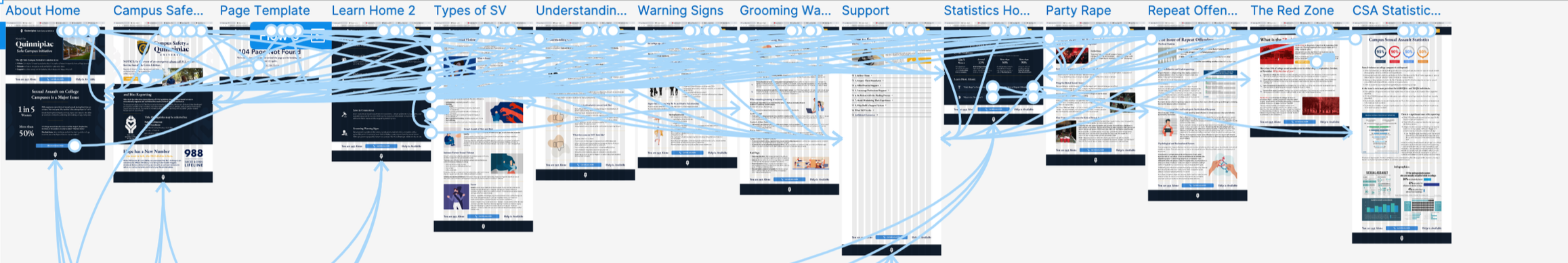
Created branding element that emphasizes support, community, and the bobcat identity
Clearly define the initiative’s mission
Empathize with users who may have experienced sexual violence
Provided readily available resources
Illustrated significance and prevalence of the issue
Offered opportunity to learn on a deeper level
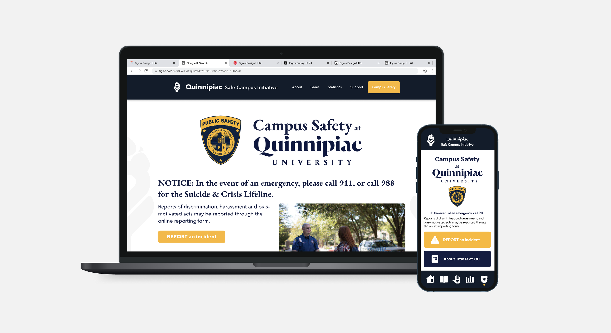
Provided five different pages/resources to help survivors understand more
Types of sexual violence, Understanding consent, Warning signs, Laws in Connecticut, Grooming warning signs
Each page contains accessible information, designed to empathize with users without alienating them
clearly established hierarchy helps to divide information and guide users
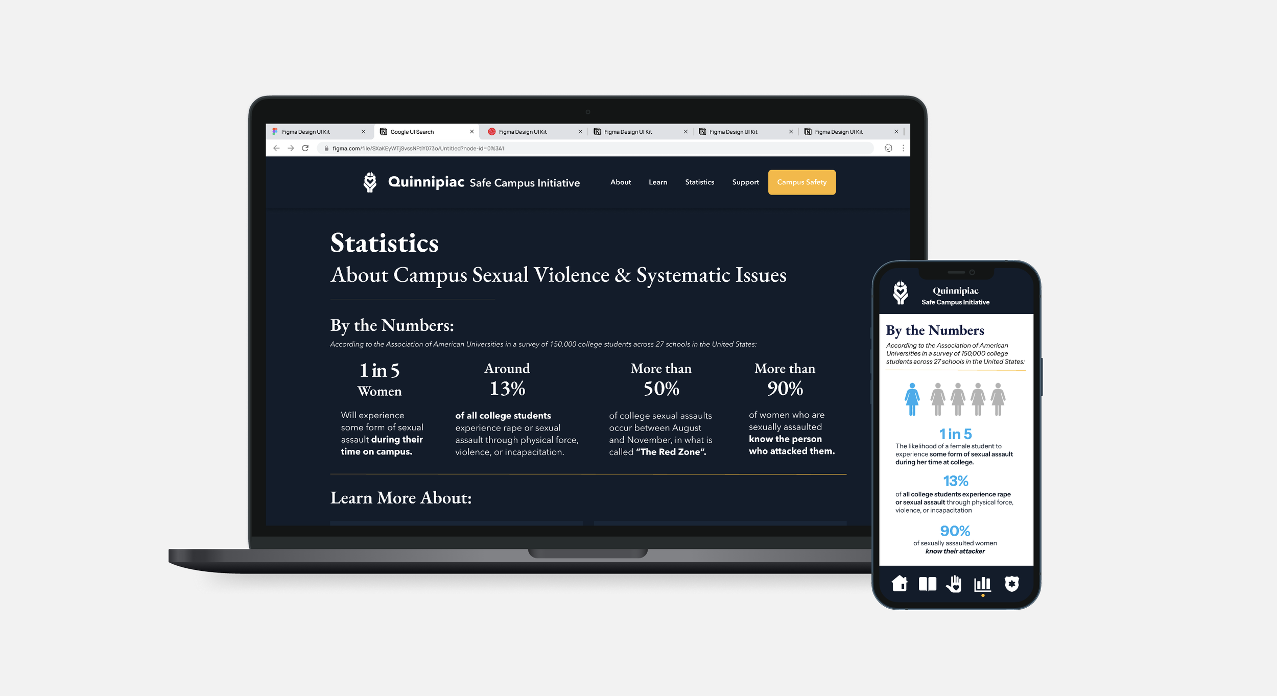
provided primary statistics for users
provided even more learning content about issue-specific statistics
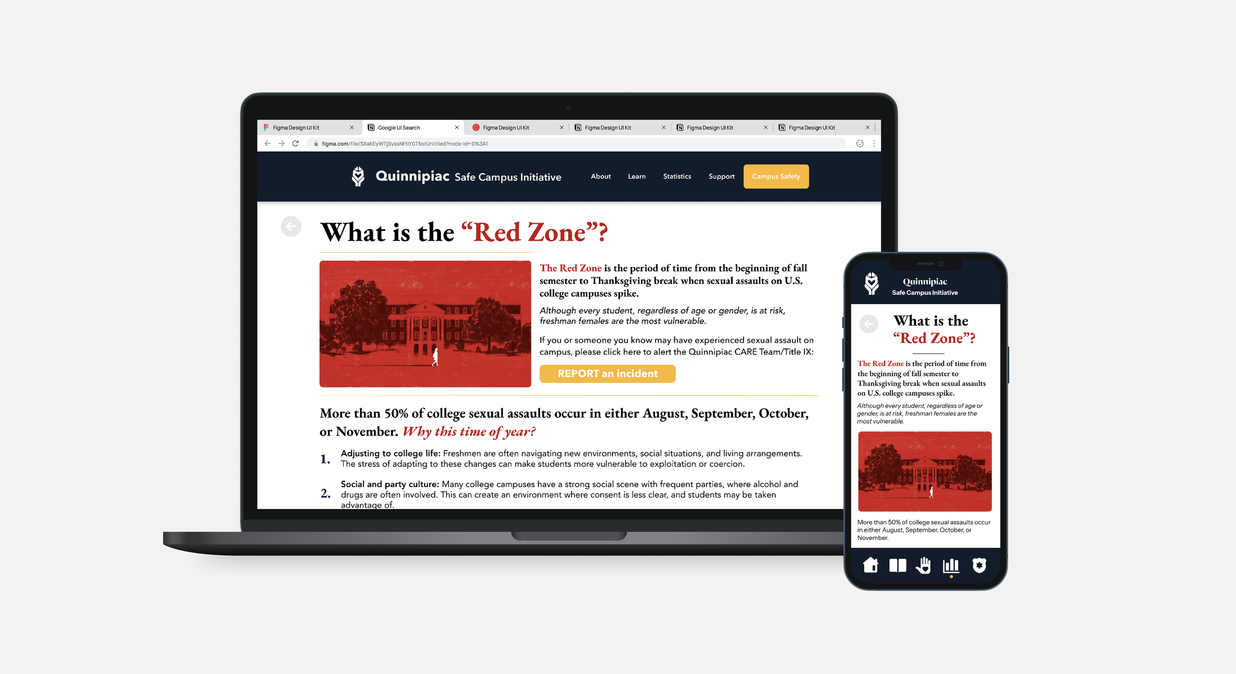
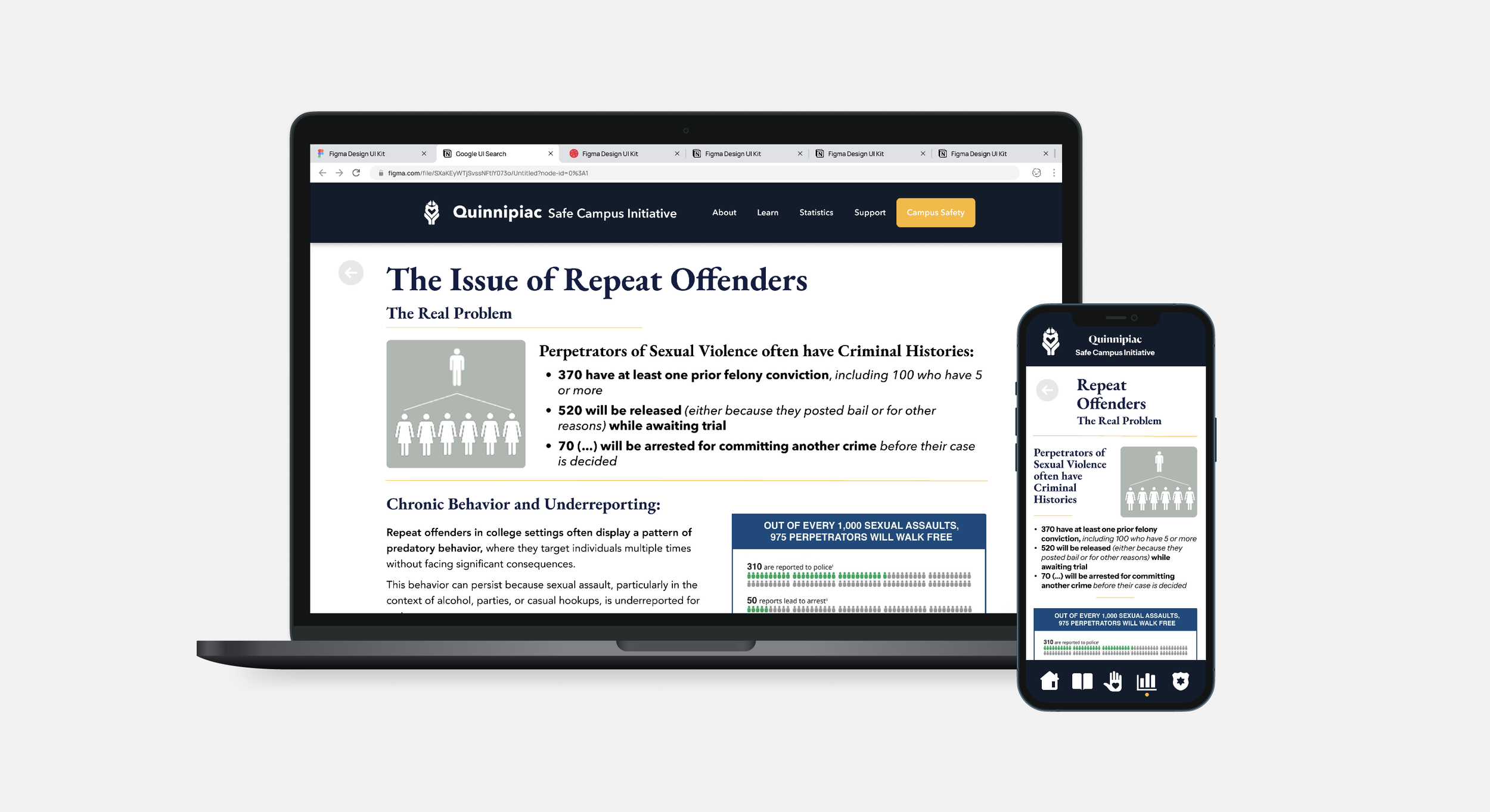
party rape / fraternities; repeat offenders; the “red zone”; overall campus statistics
pages have “report” feature embedded, highlighted yellow to make high priority within the page hierarchy
reiterated the support through the consistent bottom banner w/ hotline
utilized hug imagery to show comfort and support
utilized gentle language
interactive “FAQ-style” element so users can locate the content most important to them
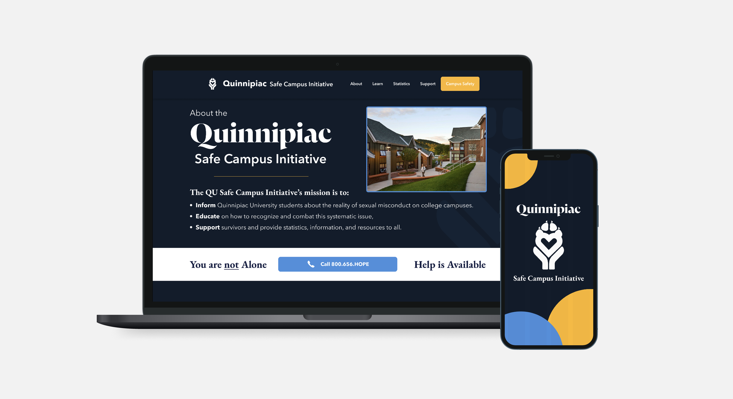
different button color on the navigation to guide users there to make reports
clear visuals that show campus safety resources
provides information about the university’s Title IX office and the information for the head coordinator, as well as a link to the official page on the university’s website
also provided more details about the 988 lifeline and links to their official website
Prototyping
Methodology
Design high-fidelity wireframes from the beginning, focusing on layout clarity, accessibility, and emotional tone.
→ Goal of creating a calm, structured interface that prioritizes user needs in high-stress situations!
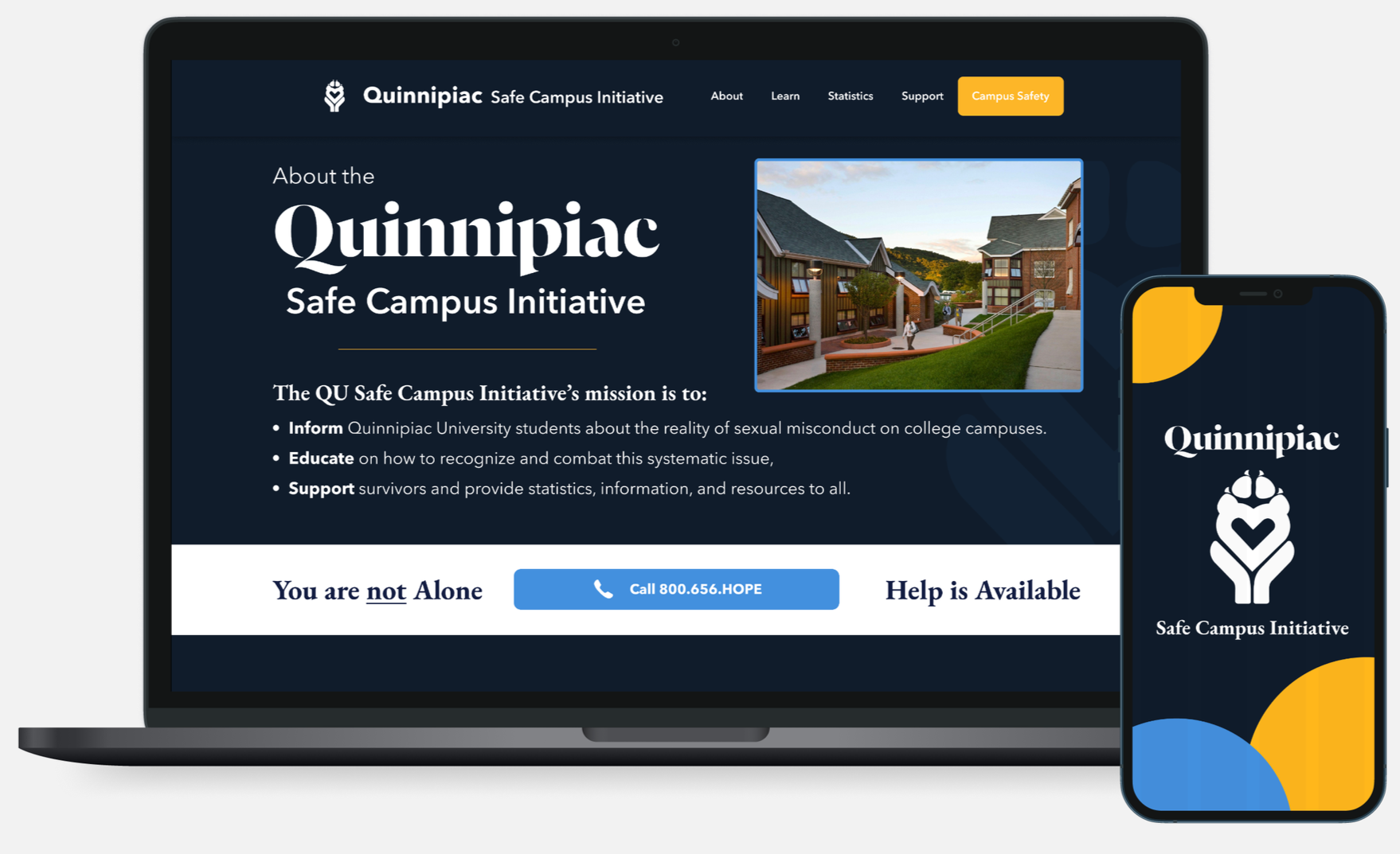
FINAL DESIGN
The redesigned experience includes pages that addressed the aforementioned pain points:
Homepage with immediate support access | Guided reporting flow | Resource directory | Educational content pages | Contact and support pages

This project highlighted the importance of designing for sensitive, high-stakes experiences where clarity, trust, and emotional awareness are essential.
What I Learned:
Designing for vulnerable users requires empathy-driven decision making
Clear structure and hierarchy reduce cognitive and emotional overload
Tone and language significantly impact user trust
Accessibility is not optional in critical information systems.
Future Opportunities
If continued, next steps would include:
Usability testing with a broader student audience
Collaboration with additional campus organizations
Integration with real-time support systems
Ongoing content updates and feedback loop
REFLECTION