

Little Free Library
App Redesign
Little Free Library
App Redesign
This project reimagines the Little Free Library mobile experience through a UX/UI redesign focused on clarity and usability.
Project Type: UX/UI Case Study (Academic Project)
Role: UX Researcher & Product Designer
Timeline: Spring 2026 (01/26/26-02/23/26)

OVERVIEWLittle Free Library is a global nonprofit initiative built around community book sharing. While the physical experience encourages discovery and connection, the official mobile app introduces usability friction that limits engagement.
Objective
The Little Free Library mission centers on community and discovery — yet the mobile experience failed to reflect these values.
Confusing navigation and unclear interaction paths
Initial evaluation revealed that users struggled with:
Poor mobile ergonomics (hard-to-reach actions)
Visual clutter and outdated interface patterns
Lack of onboarding for new users
Goals
Improve usability and navigation clarity
Create stronger visual hierarchy
Support both new and returning users
Align digital experience with the joy of physical library discovery
Modernize the interface while respecting brand identity
DESIGN PROCESS

Empathize

Define


Ideate

Prototype
Prototype
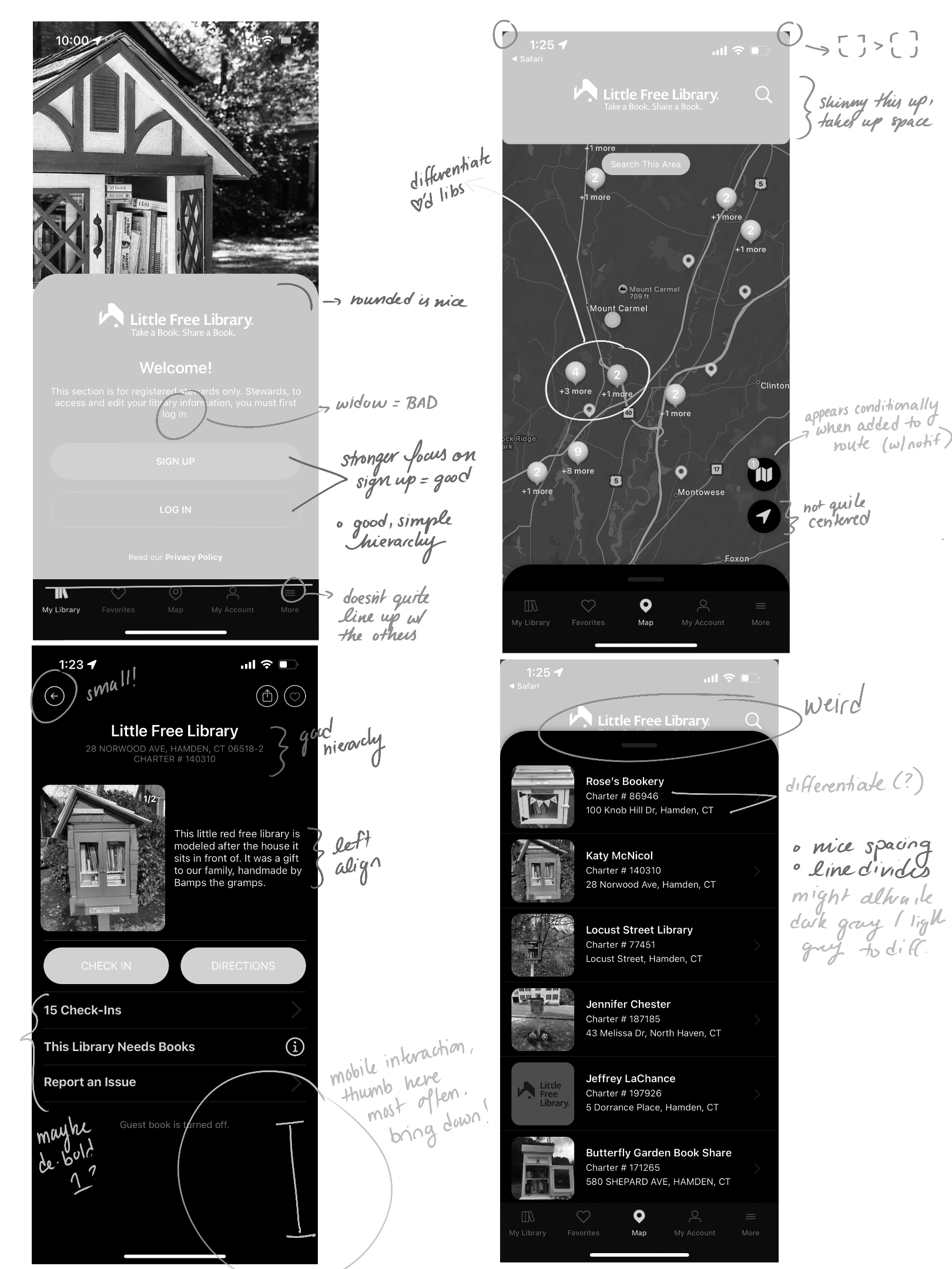
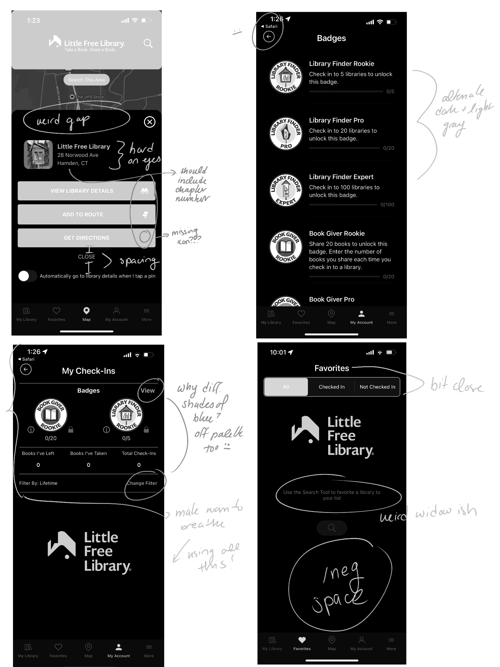
UX/UI Analysis
The audit established a baseline understanding of where friction occurred in the user journey. A full interface audit identified recurring usability issues across screens:
Excess negative space without purpose
Inconsistent hierarchy
Hard-to-see primary actions
Navigation appearing before authentication
Important information hidden behind scrolling
Key Design Changes
LOCATION WITHIN THE APP
Landing & Login
Onboarding
& Authentication
Map Experience
(Core Feature)
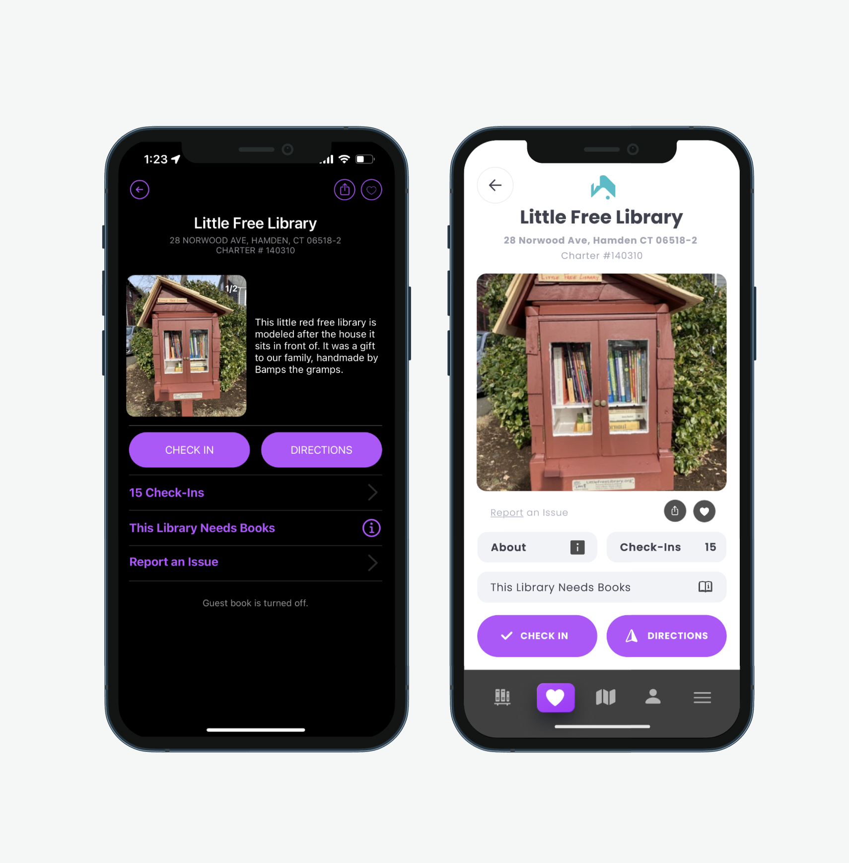
Individual Library Page
Account
& Navigation System
IDENTIFIED ISSUE
Login button lacked visibility
Navigation shown before authentication
Visual inconsistency with brand colors
No guided introduction
Content required unnecessary scrolling
Hard-to-reach navigation elements
Visual clutter
Poor thumb reach accessibility
Competing interface elements
Important actions difficult to reach
Images too small to support real-world navigation
Excess informational text
Lack of hierarchy
Sign-out visually hidden
Pages felt impersonal
IMPLEMENTED SOLUTION
Simplified landing layout
Clear sign-up vs. login hierarchy
Removed premature navigation
Unified color palette
Streamlined onboarding flow
Alternative sign-in options
Improved readability and accessibility
All essential content visible without scrolling
Reduced header size
Emphasized map as primary interaction
Repositioned search within natural thumb zone
Simplified footer elements
Enlarged imagery
Prioritized key actions (Directions, Check-In)
Moved secondary information into overlays
Improved spatial hierarchy
Clear visual grouping
Icon-supported navigation
Personalized account presentation
Emphasized critical actions
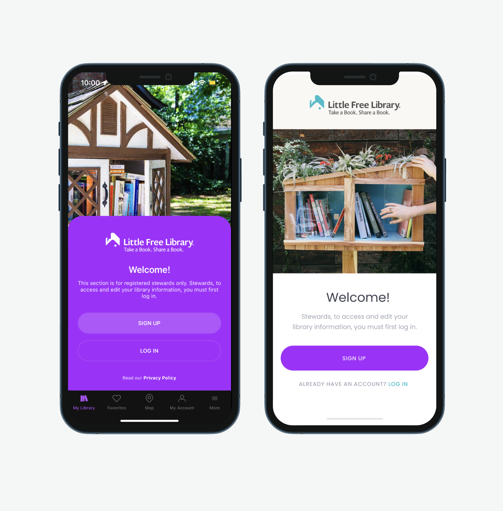
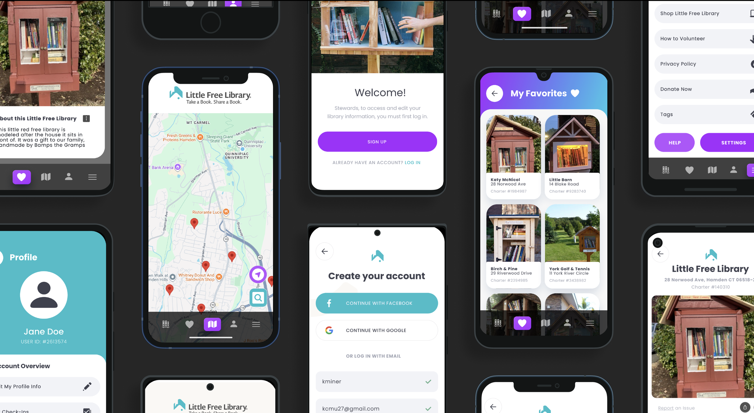
Welcome Page
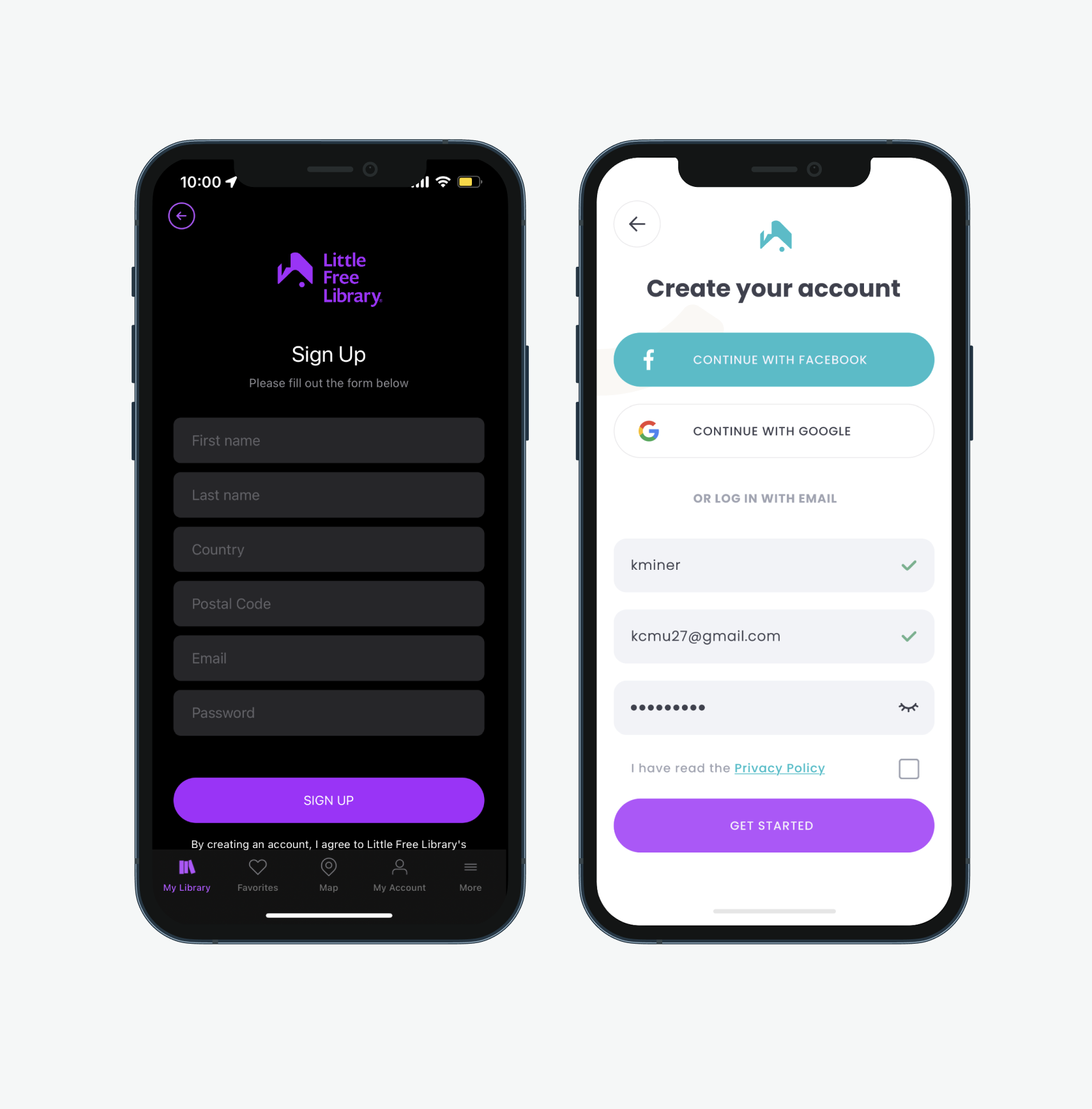
Create Your Account
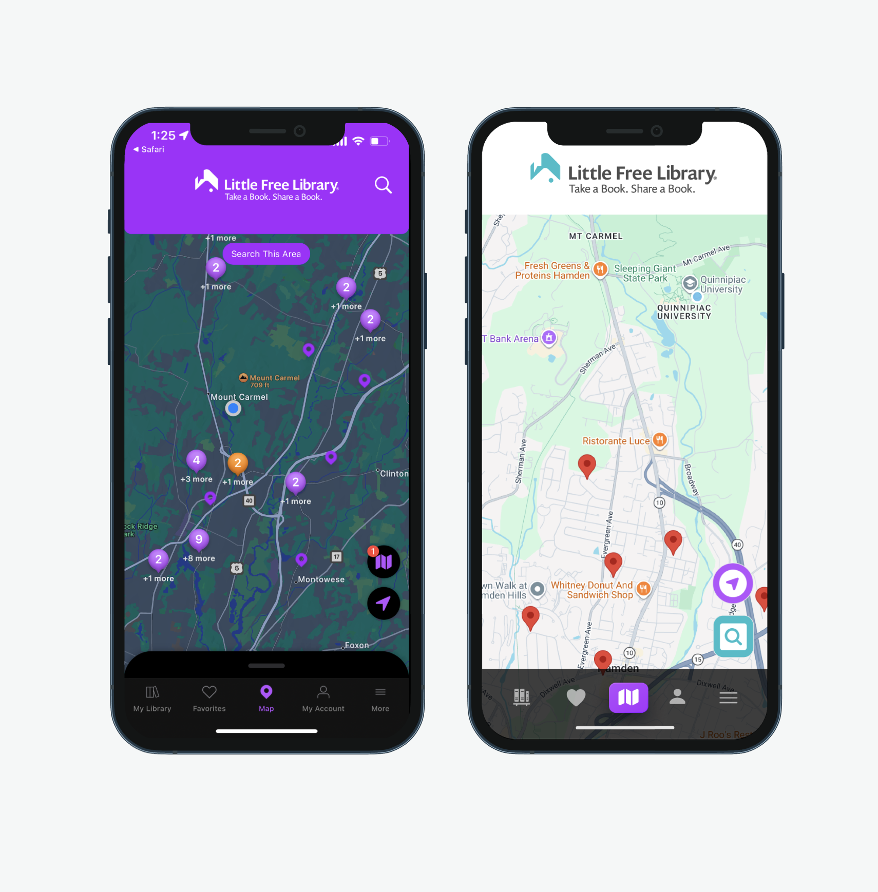
Map
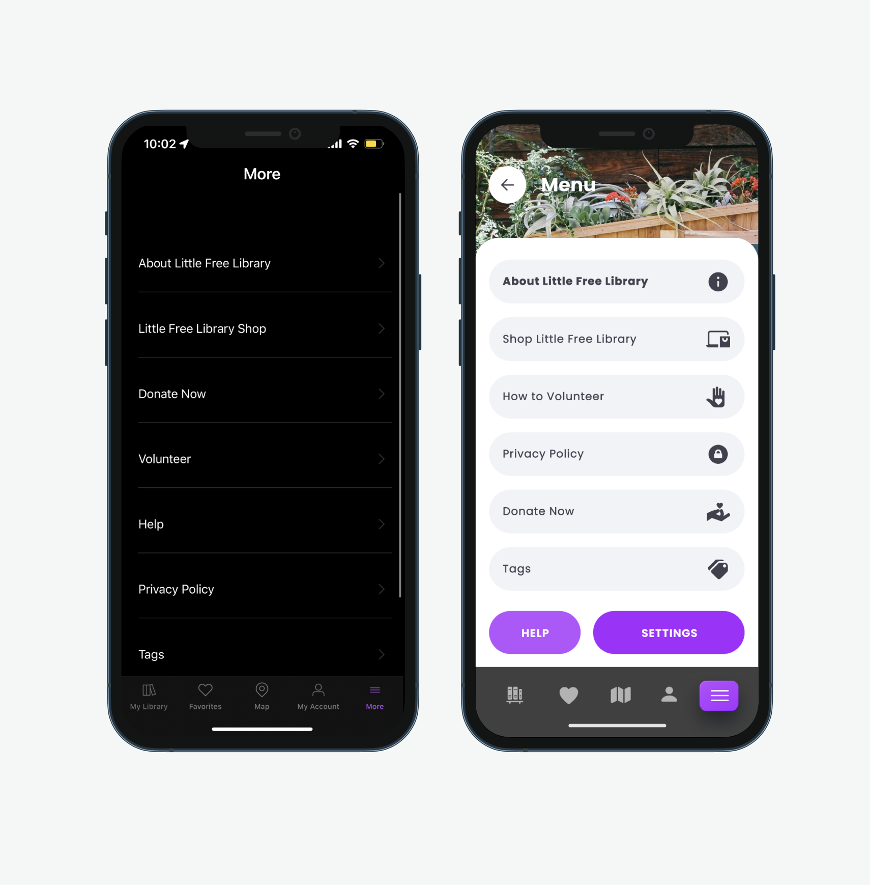
Menu
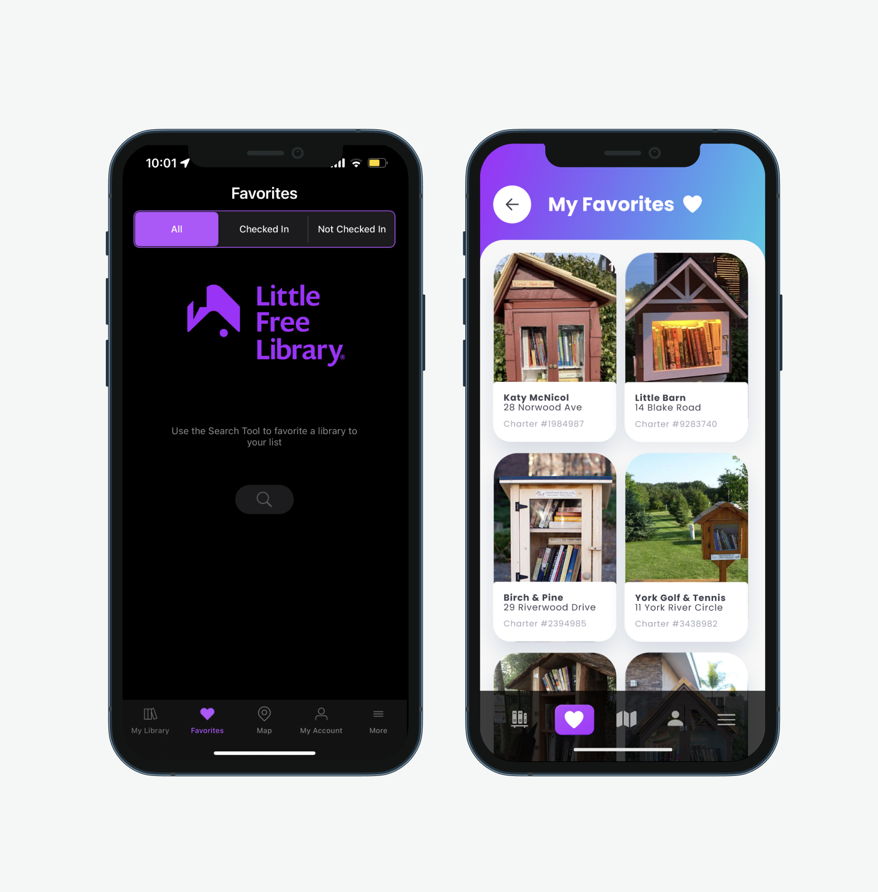
Favorites
Library

This redesign demonstrated how thoughtful UX decisions can transform an already meaningful concept into a more usable digital product.
It also reinforced my love for Little Free Libraries; I am so grateful we have so many of them on campus!
What I Learned:
Community-driven products require emotional UX, not just functional UX.
Mobile ergonomics significantly affect perceived usability.
Onboarding determines whether users continue exploring.
Small hierarchy changes create large usability improvements!
Future Opportunities
If continued, next steps would include:
Interactive prototyping and usability testing
Community activity features
Photo and update submissions for libraries
Personalized discovery recommendations
REFLECTION