QU Mobile Order
App Redesign
QU Mobile Order
App Redesign
This project reimagines the Mobile Order app experience through a UX/UI redesign focused on clarity and usability.
Project Type: UX/UI Case Study
Role: UX Researcher & Product Designer
Timeline: Spring 2026 (01/26/26-02/23/26)
OVERVIEWQuinnipiac’s Mobile Order app gets the job done, in terms of allowing students to order ahead at many of QU’s dining locations. However, the user experience could be greatly improved for smoother user flow, and the user interface could be updated to make option selection clearer, like that of other food-ordering apps.
TARGET AUDIENCESPrimary: Students living on Quinnipiac’s Mount Carmel Campus
Secondary: Any QU student wishing to order ahead at one of the campus’ many dining locations
DESIGN PROCESS

Empathize

Define


Ideate

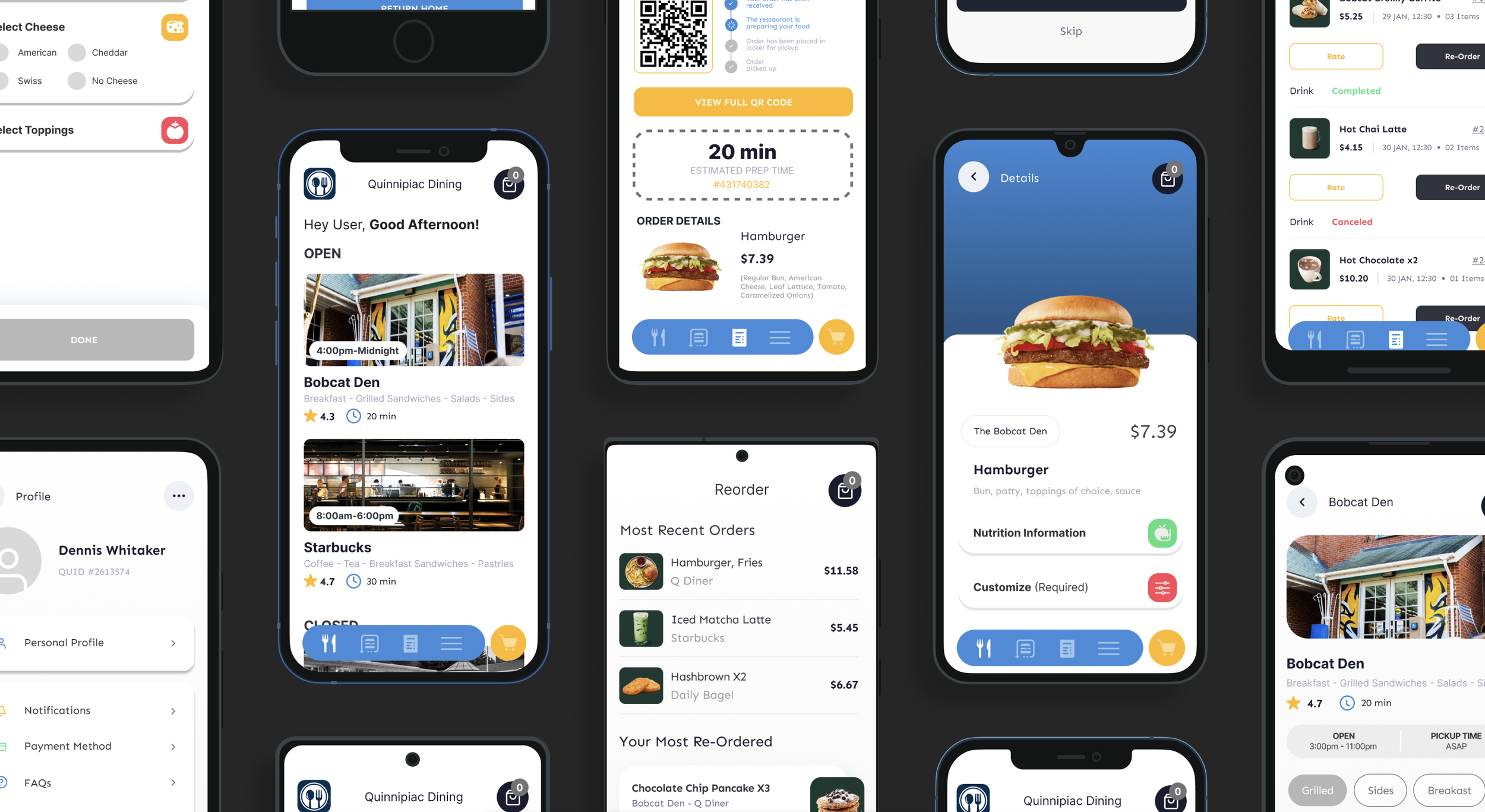
Prototype
Prototype
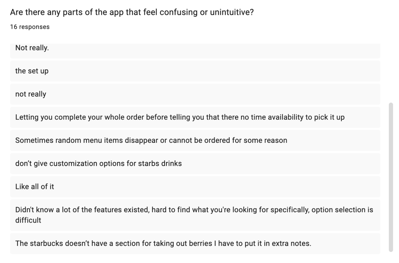
USER RESEARCH
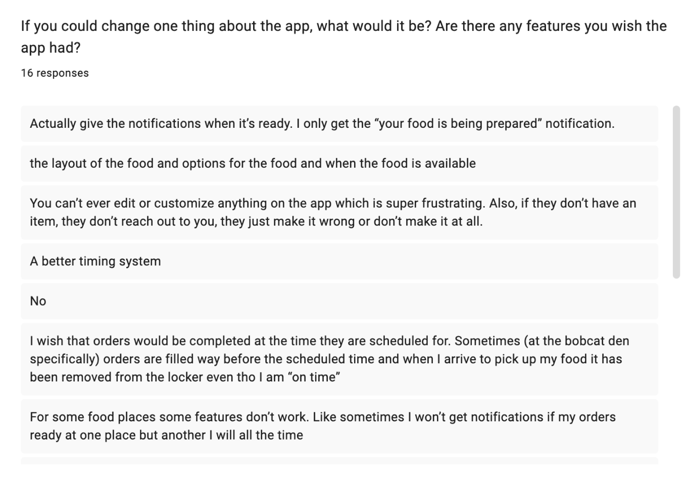
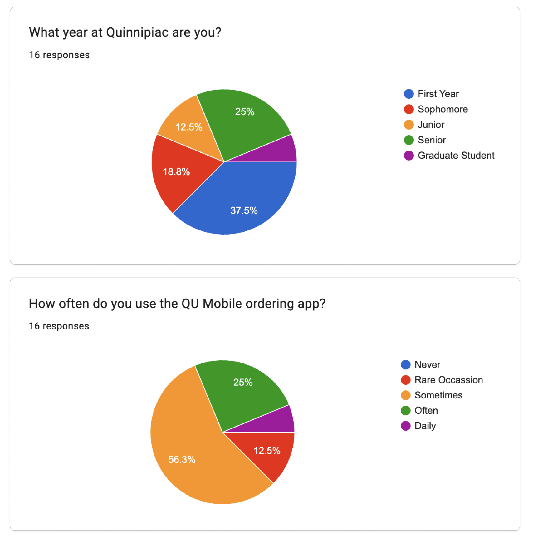
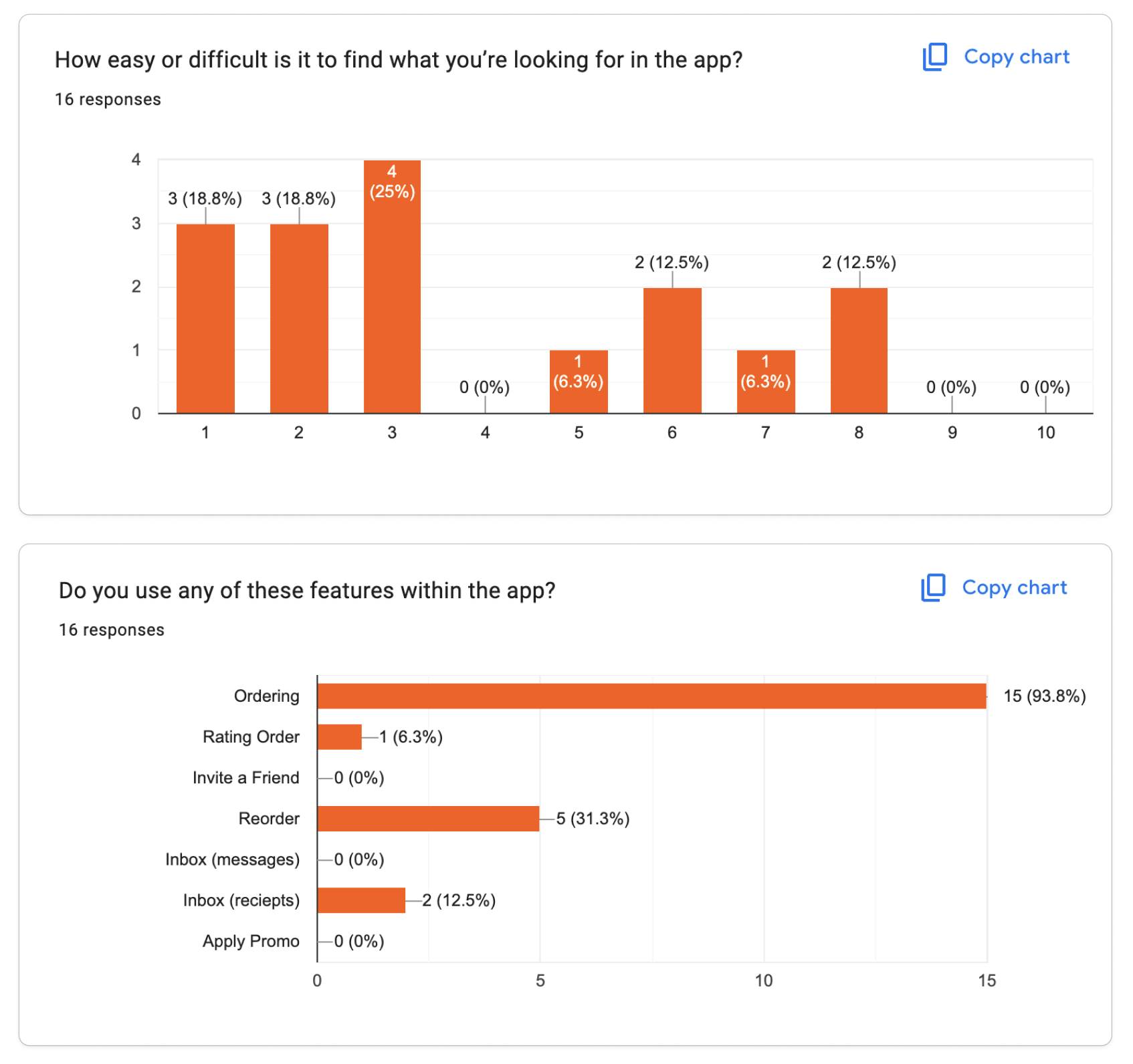
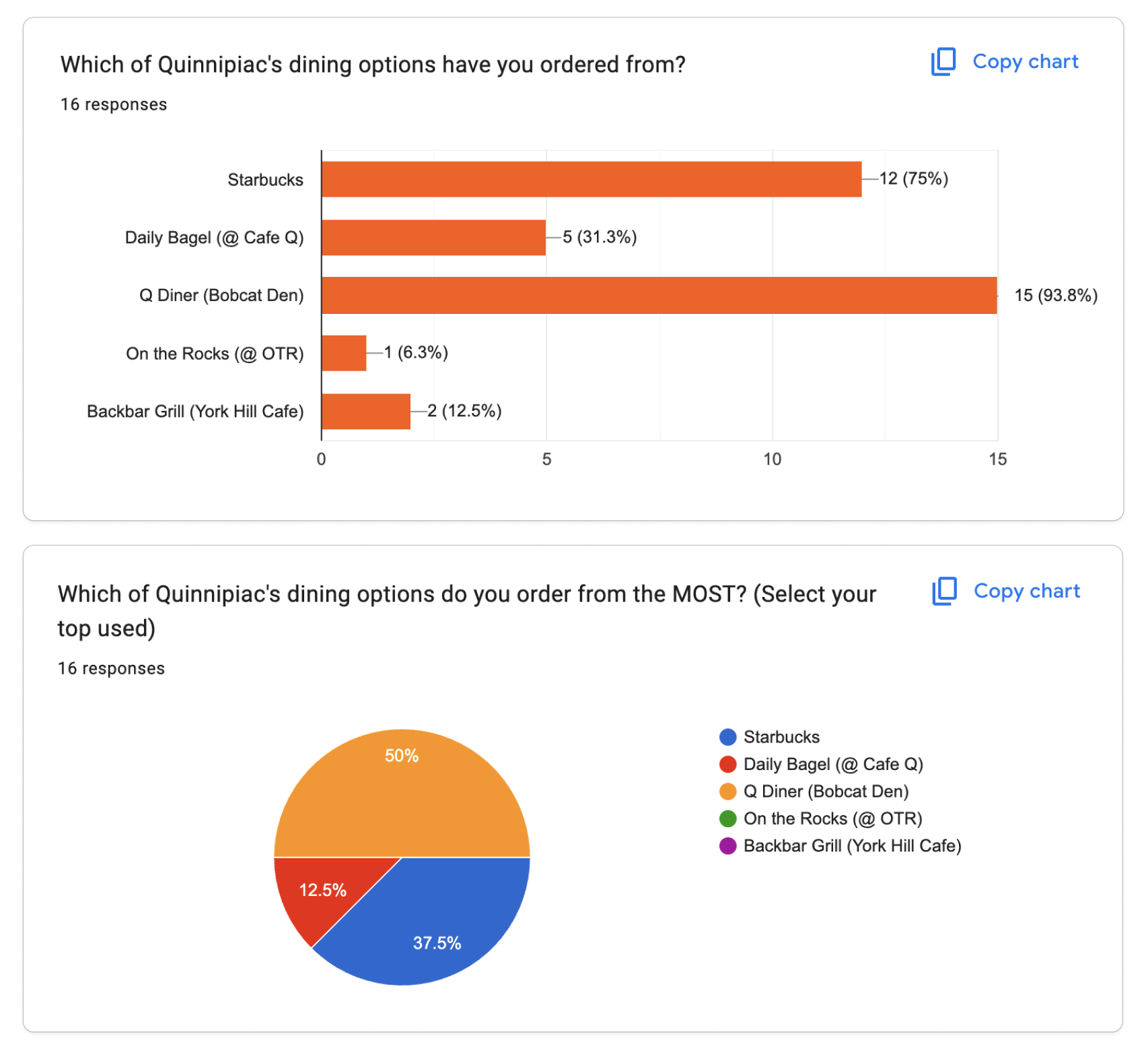
I collected both quantitative + qualitative data in an original survey from current Quinnipiac students to get a deeper understanding of their experiences, frustrations, and suggestions on how the current mobile ordering app could be improved.
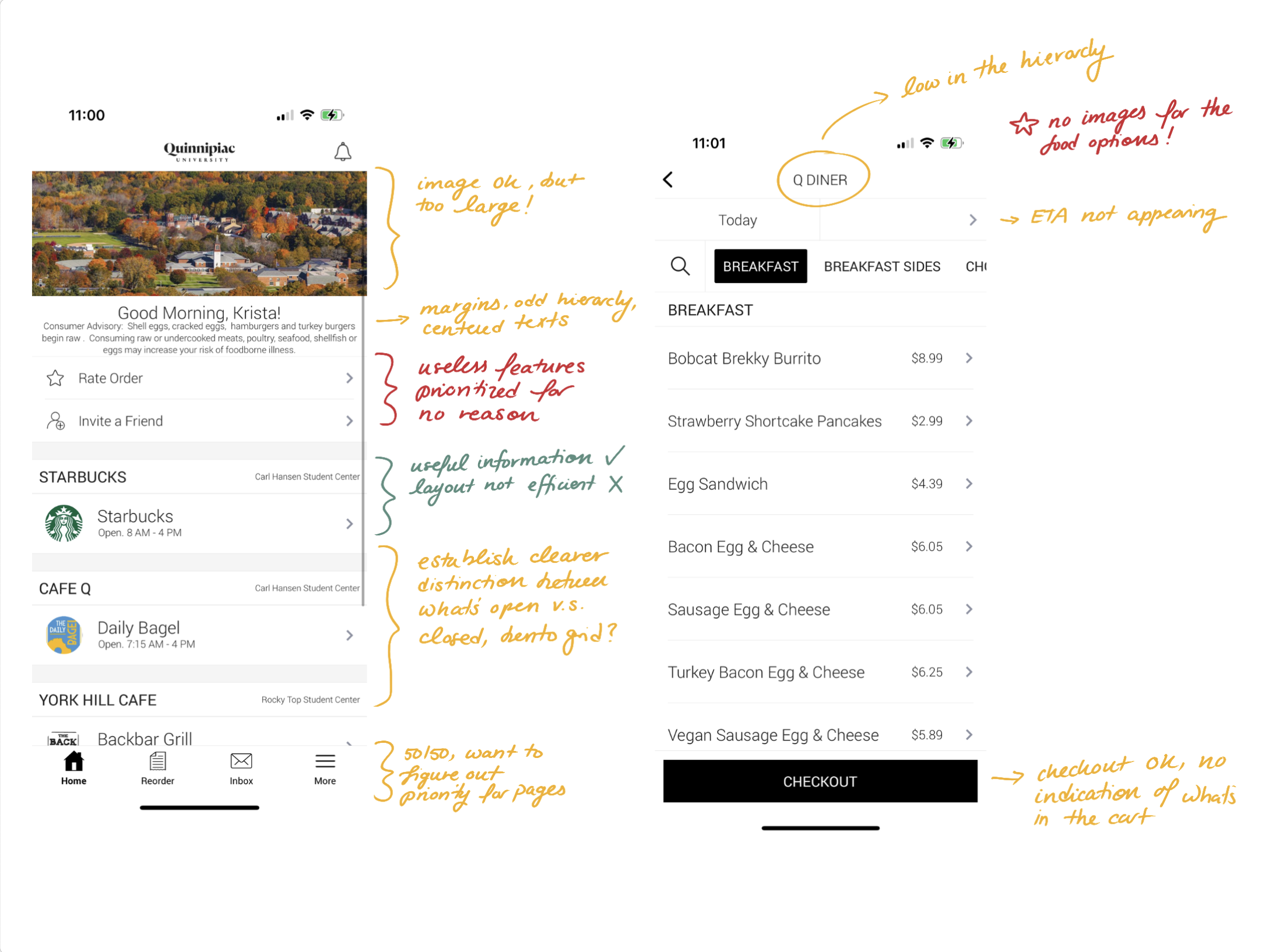
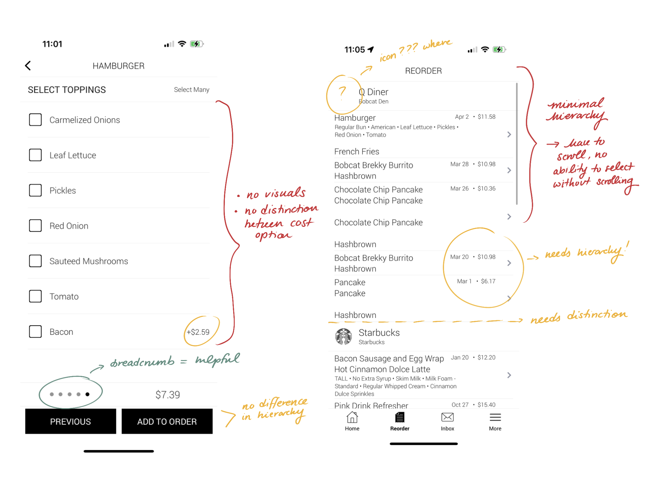
This research provided critical insights, especially with regard to the lack of usage of the app’s features compared to how prioritized they were in the app.
SWOT Analysis
STRENGTHS: gets the job done, notifies users when order has been printed and is being prepared, allows users to filter the items they wish to purchase, relatively easy-to-follow user flow
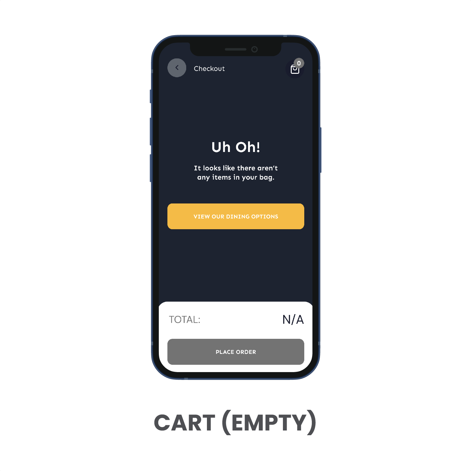
WEAKNESSES: doesn’t notify users when food is ready for pickup, some usability issues, lack of visual guidance and/or hierarchy, monotonous color palette, doesn’t evoke QU’s school spirit in a meaningful way
OPPORTUNITIES: the app has good bones, and works as a great foundation for an even better mobile app experience; has some guiding transitional elements etc, but could be made even better
THREATS: the only other mobile ordering alternative would be the Starbucks app (in terms of on-campus ordering), most other locations are restricted to mobile-ordering-only (e.g. the Q Diner at the Bobcat Den)
UX/UI Audit
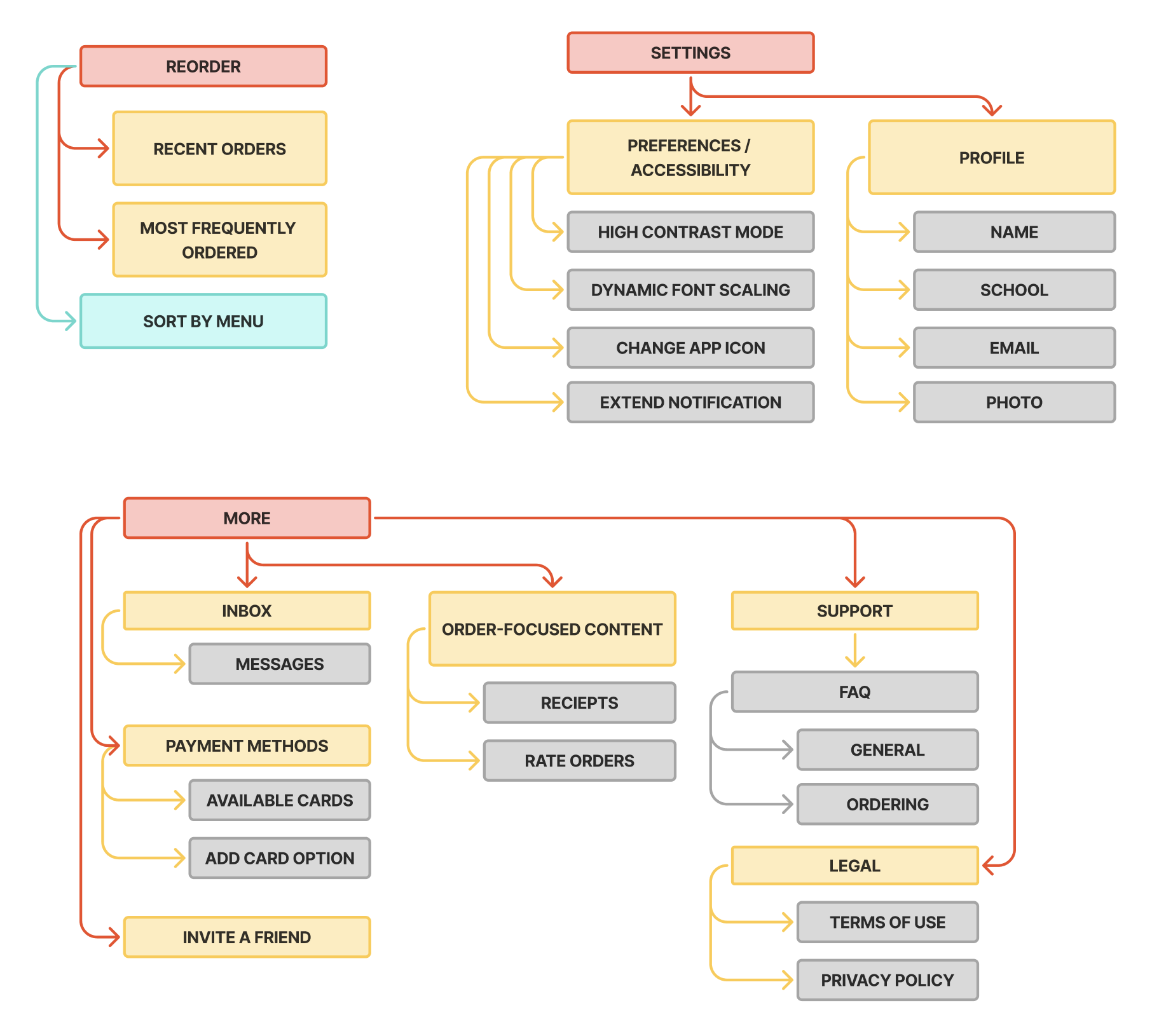
Information
Architecture
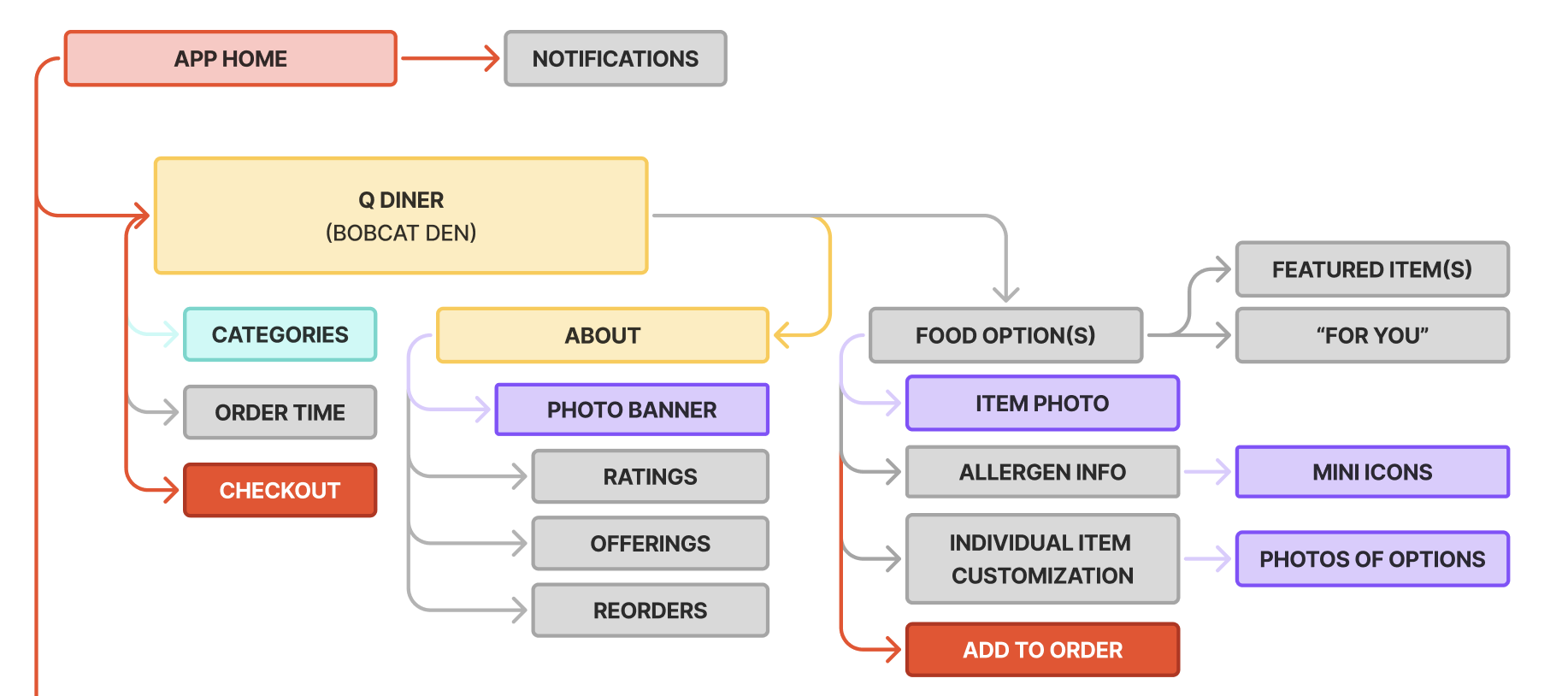

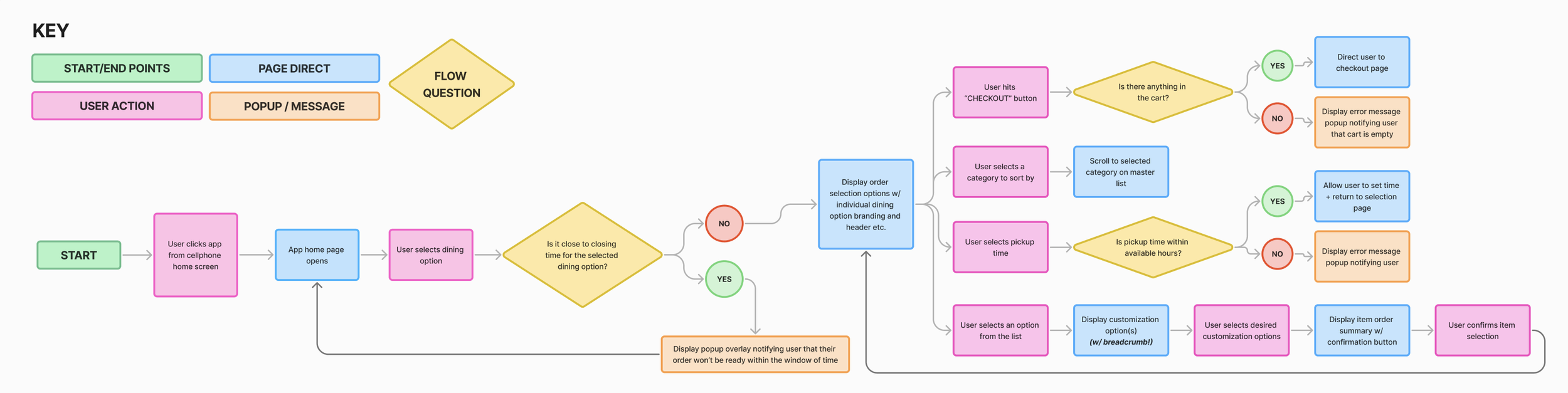
Defining Main
User Flow
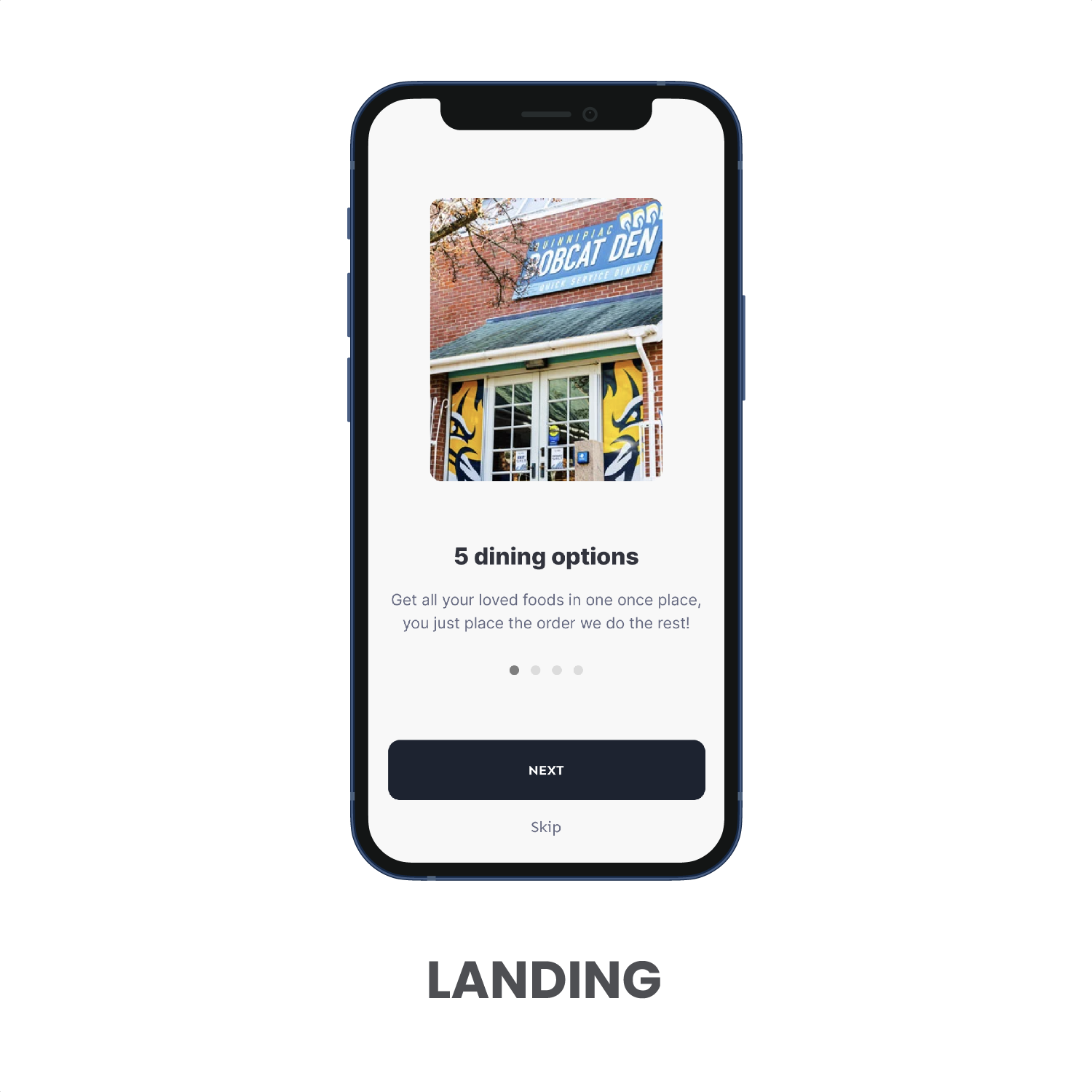
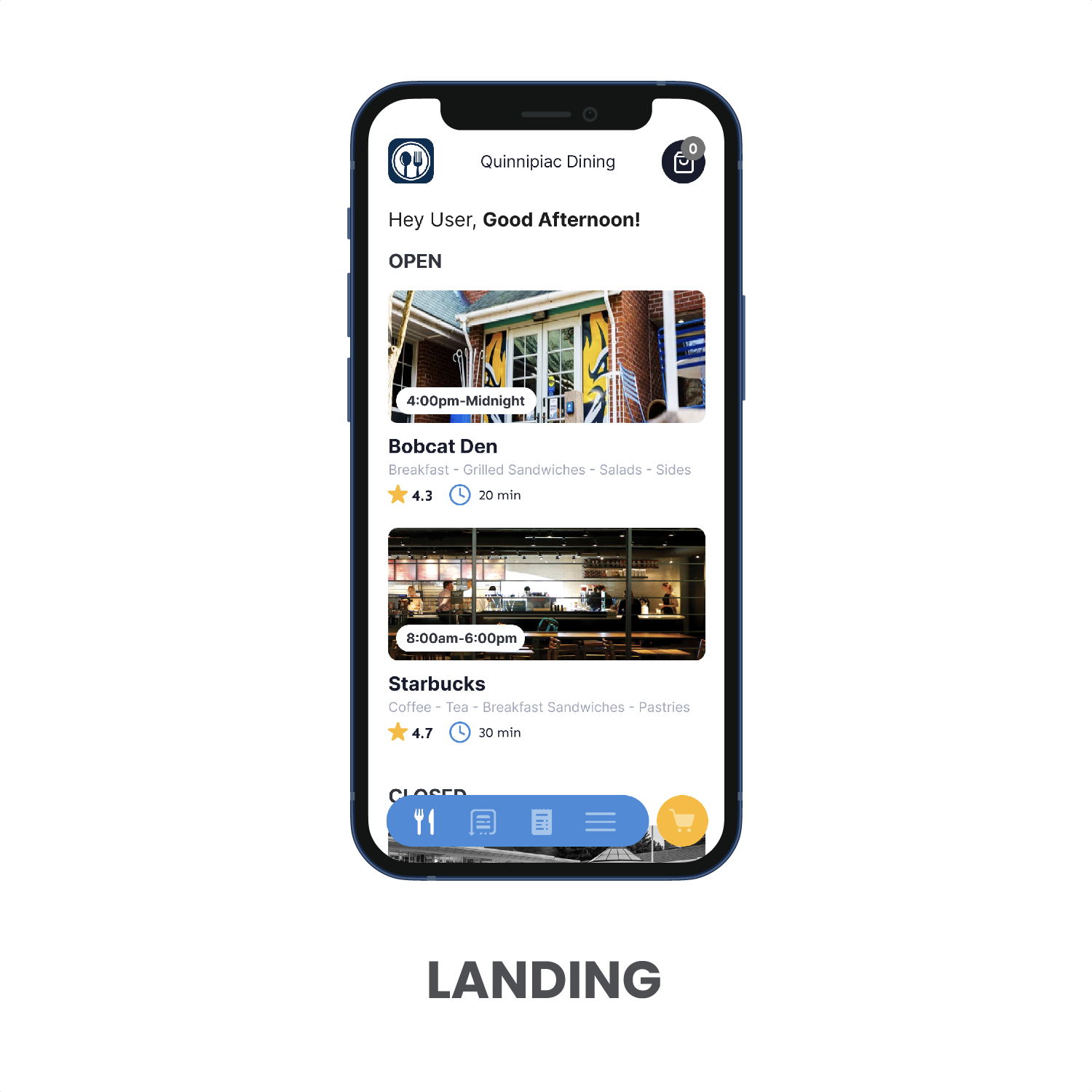
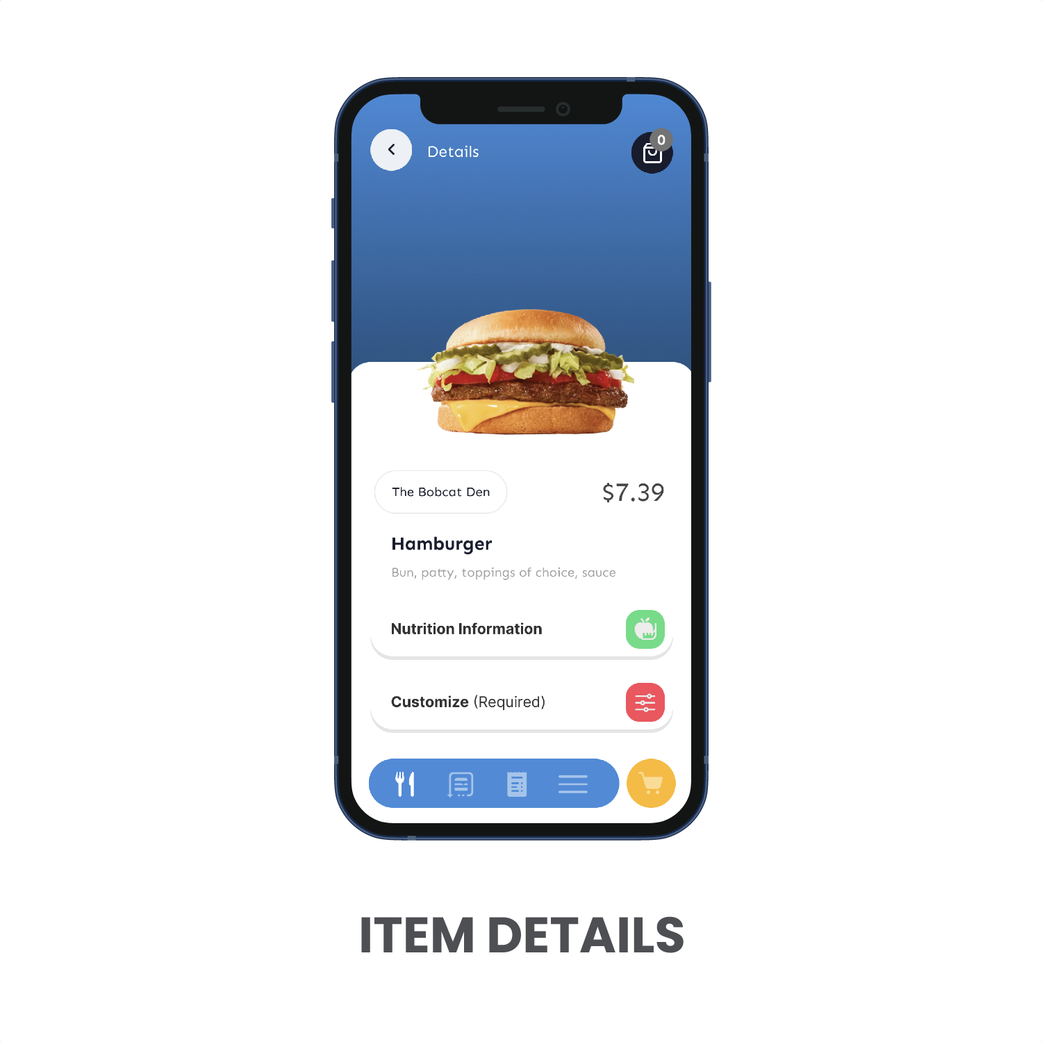
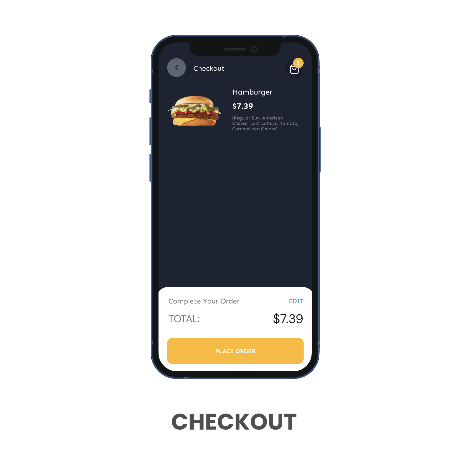
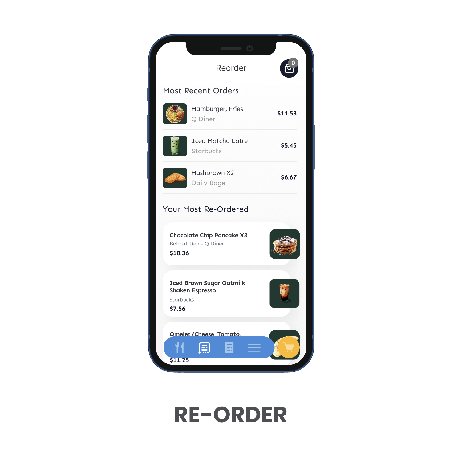
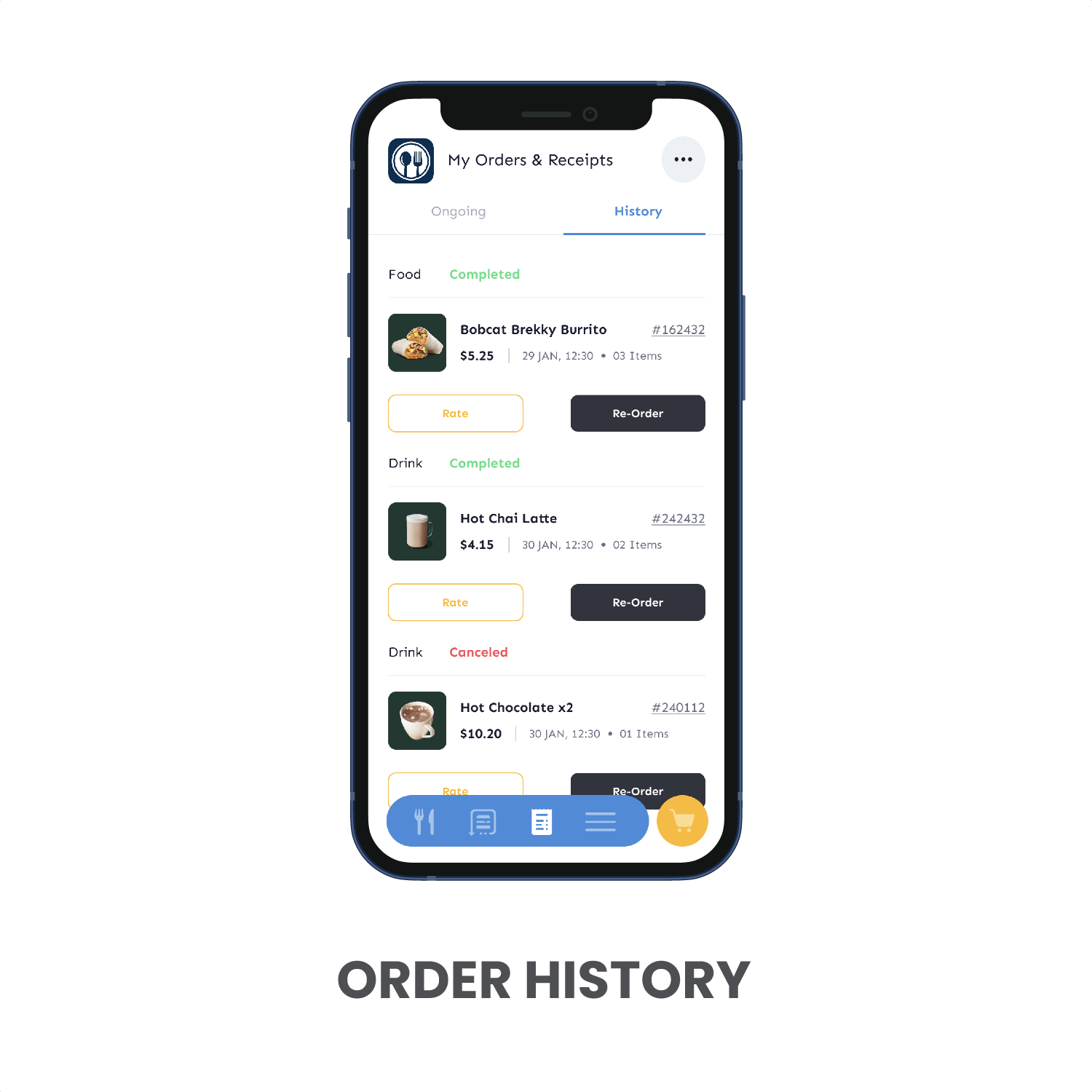
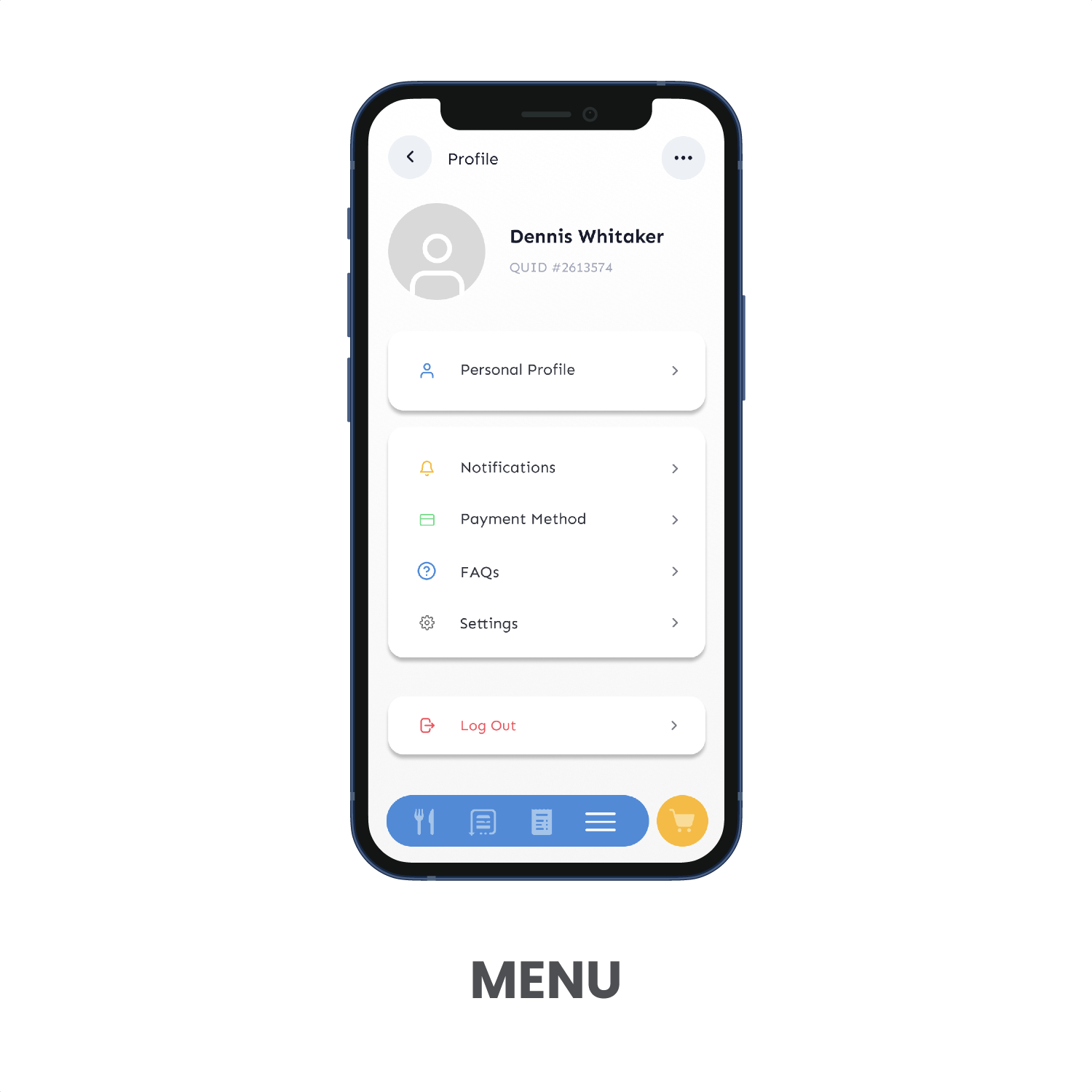
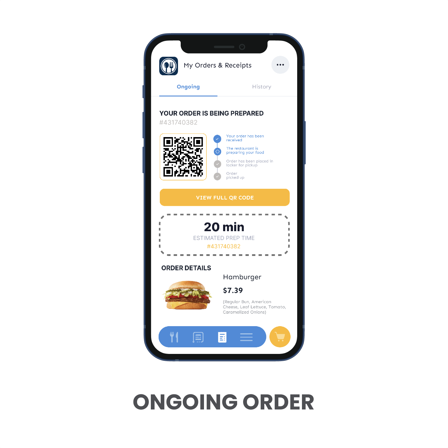
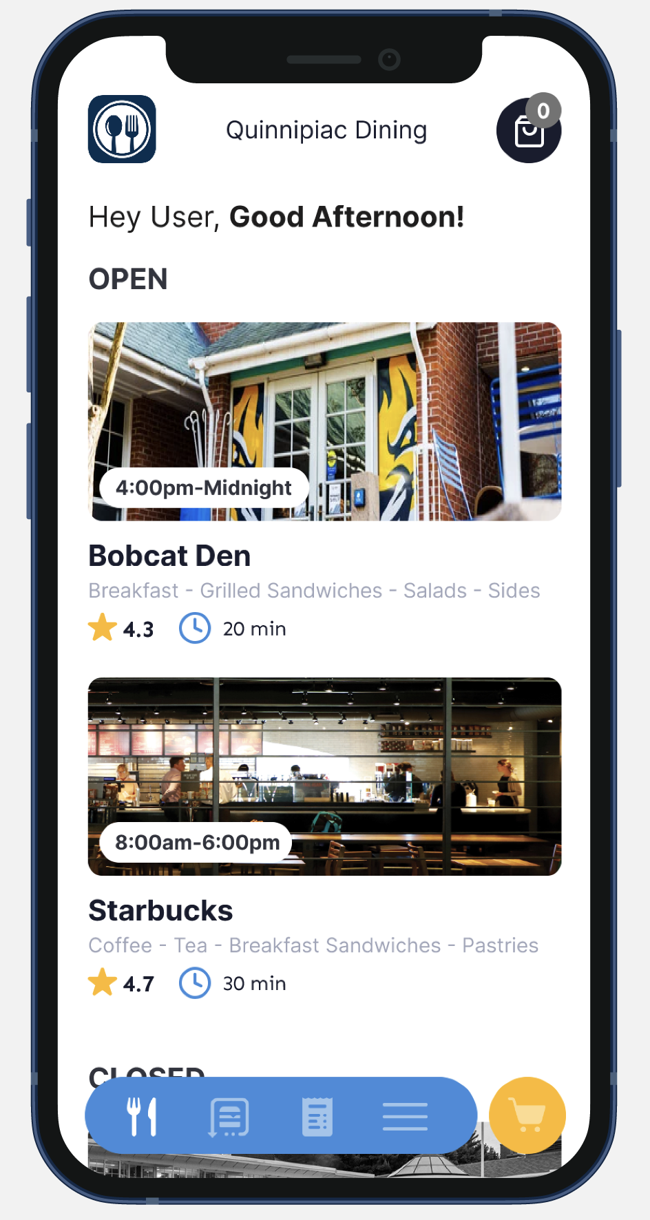
FINAL SCREENS